Booking
Case Study: Redesigning flight booking flow on VietJet Air’s website to promote sales and up-sale
Case Study: Redesigning flight booking flow on VietJet Air’s website to promote sales and up-sale
Dec 1, 2023
Dec 1, 2023
My role
UX Designer: Dam Khanh Hoang, Tra My Do, Nhat Duy Nguyen
UI Designer: Dam Khanh Hoang, Tra My Do, Nhat Duy Nguyen
Overview
This project is the Practice project we created while attending UXFoundation's course: Psychology of UX Design. My team proudly walked away with the "Best Team" award, and I was personally recognized with the "Hero of PXD" award for my contributions.
Overview
Let’s talk about VietJet Air
VietJet Air is the first private airline in Vietnam, targeting customers who need to travel at a low cost.
VietjJet Air’s long-term goal is to become a multinational airline group with a wide network of flights throughout the region and the world, and to be a brand loved and trusted by customers.
So what happened with this “beloved” airline
Despite its great vision and a cool mascot, this brand is receiving no mercy from the market.
Many competitors
The airline is facing stiff competition from new domestic airlines like Bamboo Airways and Vietravel Airlines, as well as foreign airlines such as Turkish Airlines, Malaysia AirAsia, Edelweiss Air, and Air Seoul Inc. This has made price competition no longer viable.
Inefficient resources spent for sale campaign
Being a low-cost carrier brand, VietJet Air runs several major sales campaigns throughout the year, such as during Tet holiday and summer travel. However, the expenses associated with these discount activities consume a significant portion of the budget.
Difficult sale on additional services
Additional services such as purchasing luggage, seats, meals, and priority check-in can provide a significant source of revenue for the airline. However, the percentage of customers opting for these services is relatively small.
Limited search results
The "book-to-look" ratio is limited on the search results page, which makes it difficult for users to compare the results and make informed booking decisions.
Our goal
Given the airline's significant investment in sales campaigns and price competition with competitors, we were in need of a cost-effective solution that would satisfy the business needs and be simple to implement.
Persona
Before delving into the airline's issues, let's take a moment to examine the target audience persona for VietJet Air.

Nguồn: UX Foundation. Persona được cung cấp bởi giáo viên để phục vụ quá trình thiết kế giải pháp.
Research - Discovery
“What wrong with the current booking process in the Website?”
To answer this question, we will be applying various design research methods.
Heuristic Evaluation
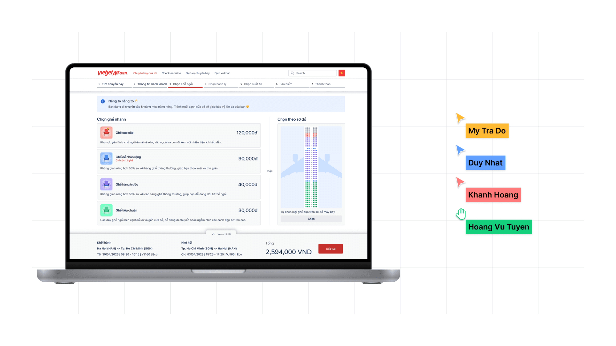
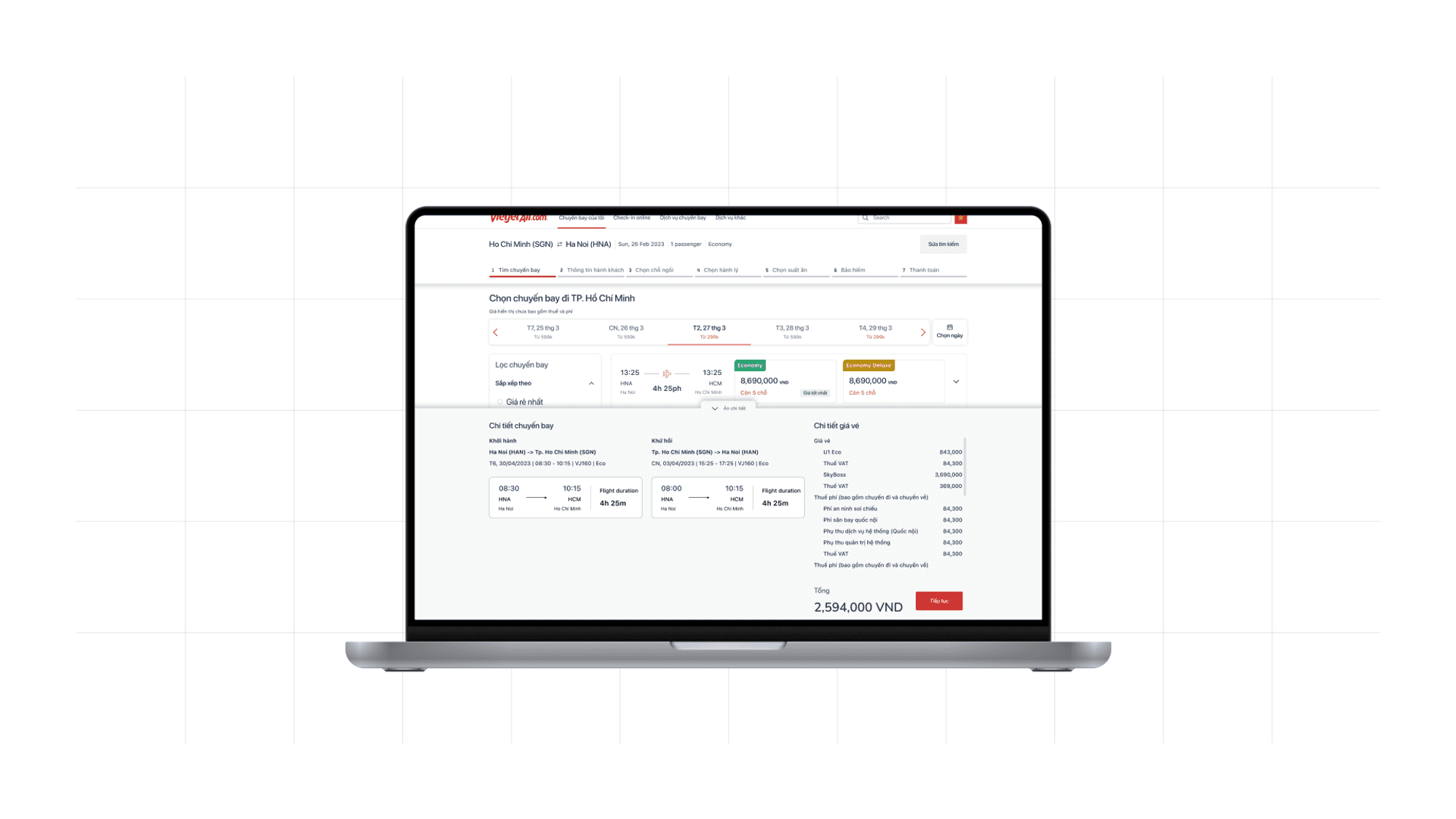
We experienced the booking process on the website ourselves, taking screenshots and identifying usability issues using Nielsen Norman’s 10 Usability Heuristics for User Interface Design.
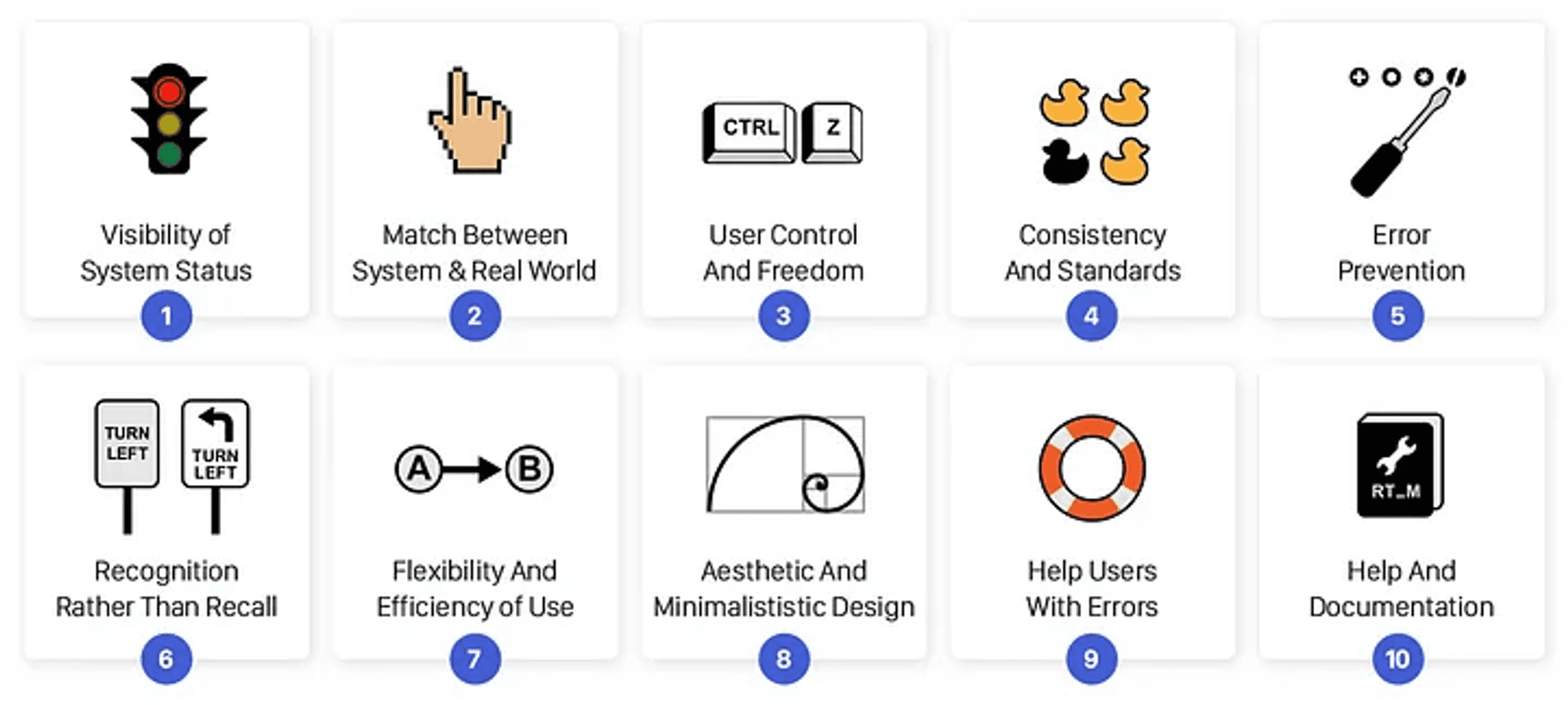
Image resource: https://uxdesign.cc/10-usability-heuristics-every-designer-should-know-129b9779ac53
Based on our research, we have identified some critical usability problems, such as:
Too many decorative elements, which causes distraction for users when performing the main action.
Sneak-into-basket dark pattern
Misleading UI components
Unnotified errors
And approximately 50+ more…
Usability Testing
How we planned the Usability Testing (UT)
By mapping down the major concern problems from the Heuristic Evaluation session, we define some specific goals for each attribute follow by:
Discoverability: The ability that user can find the information they needed
Comprehension: The ability to understand the context, meaning of the screen and able to moving forward on the flow.
Learnability: The ability to adapt and learn new usage.
Orientation: The ability to navigate on the system, to moving forward and return.
Let’s take a look at our UT Goals:
Attributes #1: Discoverability
Guide:
Can users find the information they need?
Can users find information about the cheapest fares?
Goals:
Can users easily find where to book tickets?
Can users find a way to sign up for a SkyJoy Membership?
Can users find the cheapest ticket?
Can users find the airline's offers (during the booking process)?
Can users compare flight prices between flight times? (Same day or between dates)
Are users aware that the time-out time is 15 minutes?
Attributes #2: Comprehension
Guide:
Do users understand the meaning of the screen, the context in it, and what will need to be done next?
Do users understand what surcharges they are facing?
Goals:
Do users understand meal, baggage options and insurance are optional?
Does the user understand the context and operation on the flight selection screen? (date transfer, forward price, flight status/return)
Are users aware of the missing information (departure date, return date)?
Do users understand the information requirements in the personal information input screen?
Attributes #3: Learnability
Guide:
With a new experience, do users learn/remember how to use it? |
Goals:
Can the user remember the time-out time is 15 minutes?
Attributes #4: Orientation
Guide:
Can users navigate where they are? Do they know how to go forward/backward?
Goals:
Do users know if he or she is choosing a ticket for a single trip or a return trip?
Do users know which step they are in in the booking process?
Can the users easily navigate back away from the ad?
Attributes #5: Task success
Goals:
Did users complete the task?
Attributes #6: Satisfaction
Goals:
Do users feel satisfied after using it?
After complete define the research goal, we create some scenarios for user to interact on the website that can help answer our concern.
Scenario 1: Suppose you have a need to travel from Hanoi to Saigon next month with the cheapest fares on Vietjet Air's website system. You can decide for yourself the date of departure and return to Hanoi. Please go to Vietjet Air's website to book tickets.
Scenario 2: Suppose you need to book a return ticket from Hanoi to Dalat for a family trip next month. You need to book tickets for yourself and 2 family members (including 1 small member under 2 years old). How do you find and book flight tickets to get the cheapest fares with additional services?
Participants
To get some practical data of user behavior on the VietJet Air website, we conduct Usability Testing with 5 participants that match our persona.
🙋♂️ H. C. T
Age: 21
Career: Student
Occasionally organize vacation trips and book airline tickets for the family.
🙋♀️ Q. A.
Age: 34
Career: Freelance Business
Mother of three kids, regularly organize vacation trips for families with many young children.
🙋♂️ Q. S.
Age: 27
Career: Graphic Designer
Planning vacation trip for family using third party booking platform.
🙋♀️ M. H.
Age: 36
Career: Saleswoman
Regularly book flight tickets for family and relatives, have experience in booking tickets on Vietjet Air 3 years ago.
🙋♀️ M.P.
Age: 22
Career: Student
Regularly move between Hanoi and Ho Chi Minh for school and study.
How we conduct the UT session
Due to the distance across team members as well as interviewees, we decided to conduct Remote Moderated Usability Tests through Google Meet.
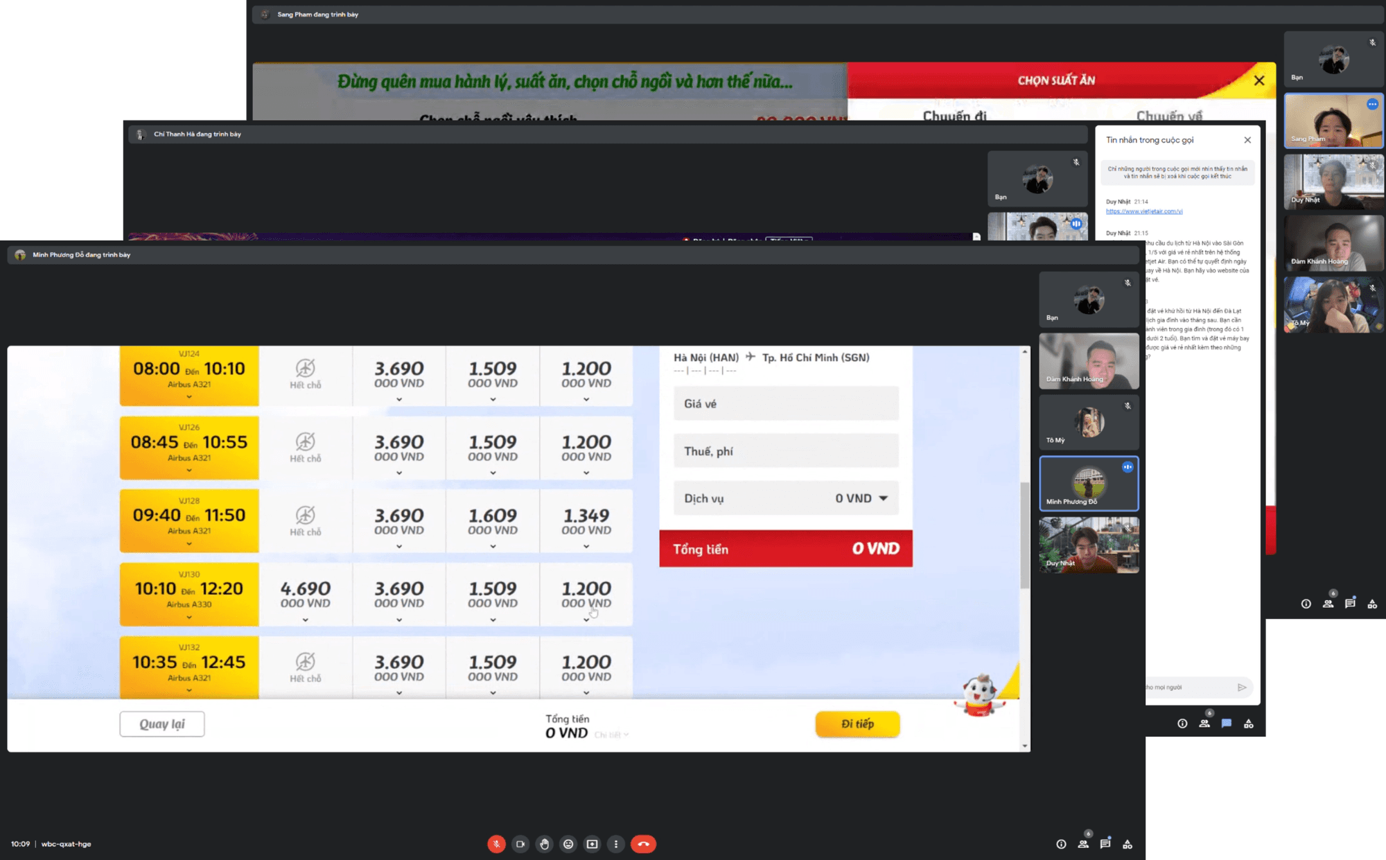
In each session, one of us worked as the facilitator, while the other two took notes on users’ struggles and feedback for the facilitator.
Results
Uh oh, it seems that users didn't have a good experience with the current website. Here are a few quotes from our participants:

Research - Define
Analyze research data
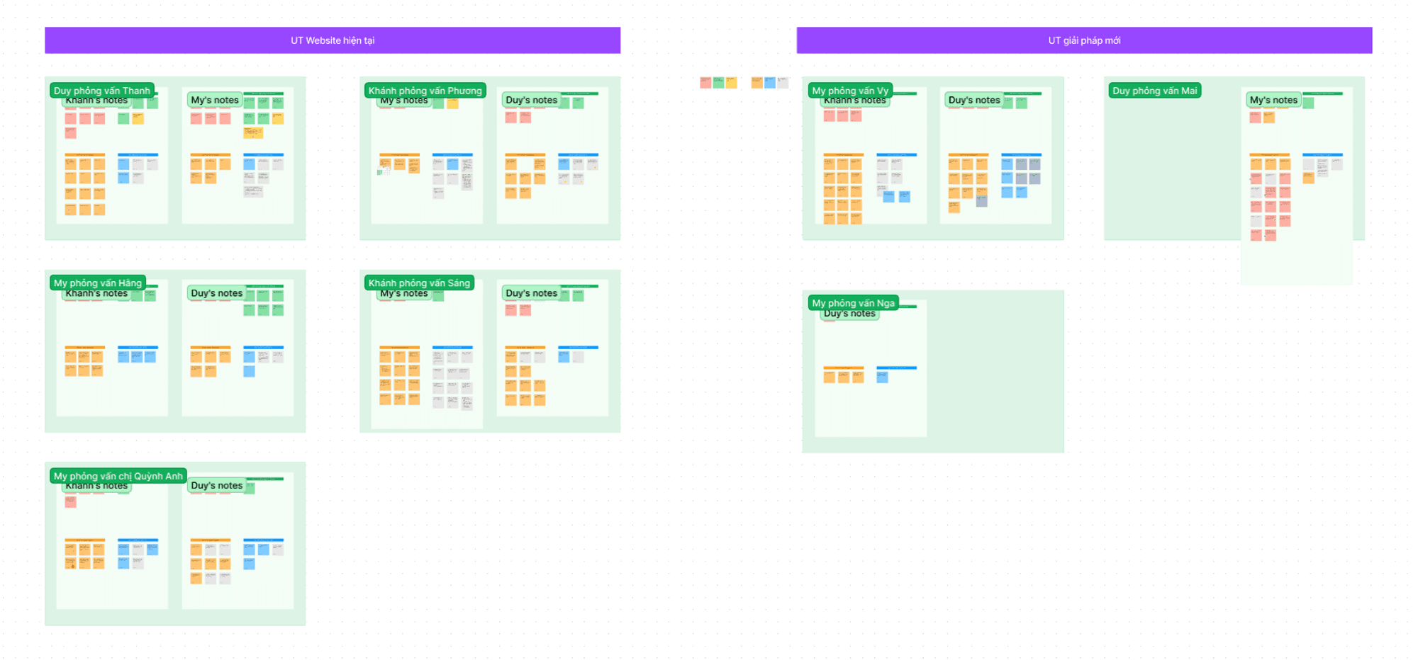
After collecting all the research findings, we analyzed them using Affinity Diagramming, a collaborative method in which we placed all the observations, findings, etc. on sticky notes in FigJam and grouped them accordingly.
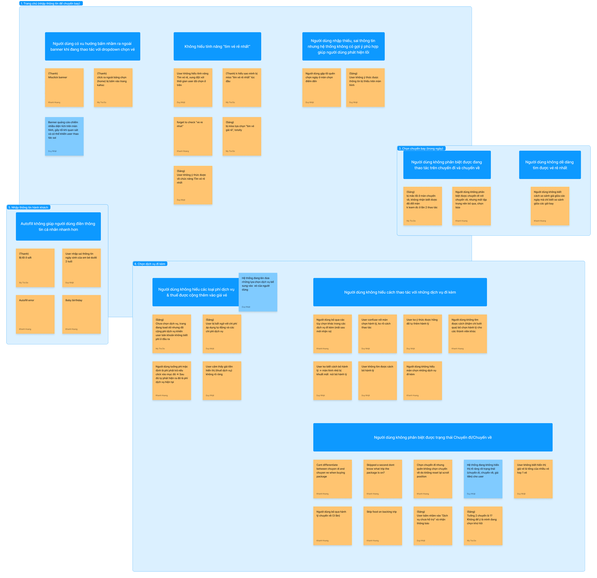
Each group represents the problems that users are experiencing when using the VietJet Air website.
Key problems
Users don't know how to filter for low-cost tickets
Features are not clearly explained.
Access to this feature is limited.
UI design makes it likely for users to ignore this feature.

Users are forced to use a lot of memory load when choosing between numerous different options.
🧠 Memory load
Can be called Cognitive Load, just like computers, human brains have a limited amount of processing power. When the amount of information coming in exceeds our ability to handle it, our performance suffers. We may take longer to understand information, miss important details, or even get overwhelmed and abandon the task.
Users don't understand why the fare increases with each step
Service fees and taxes are not clearly explained.
Through the steps, the change in the invoice is not highlighted, causing users to often ignore it.
Users don’t know they can customize the additional services
Users hardly realize that they can customize the service options that come with it.
UI design makes it difficult for users to interact with options.
Some additional services are selected by default, this could cause Reactance effect.
The Uncheck option is hidden.
🧠 Reactance
If user feel something is taking away their choices or limiting the range of alternatives. It'll trigger an opposite response to what was intended, and also increases resistance to persuasion, this could lead to abandonee the process or even abandonee the brand.
Main objectives
Improving the ticket booking experience on the website
Increasing the need to purchase additional services.
Design - Develop
Competitive analysis
Here is the list of our competitors, including domestic and foreign airlines, as well as third-party booking services.
Vietnam Airlines
Jetstar Pacific Airlines
Bamboo Airways
Vietravel Airlines
Traveloka
Turkis Airlines
Malaysia Airline
Edweiss Airline

Full version available here: Competitive Analysis
Recommendations
For features
The collapsible/expanding footer that shows ticket information.
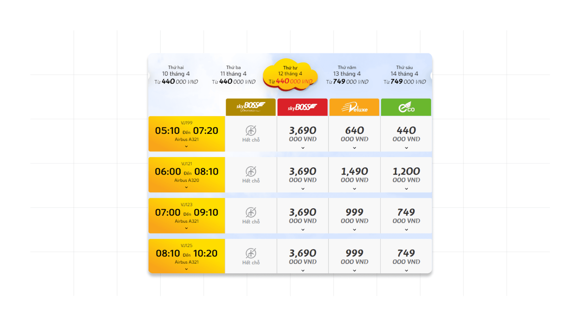
The calendar view that includes the lowest ticket price on each day.
Allow users to choose their desired ticket class from the beginning to help them filter their search and find the best option to suit their needs.
Allow sorting the order of flights according to users' needs.
For Design
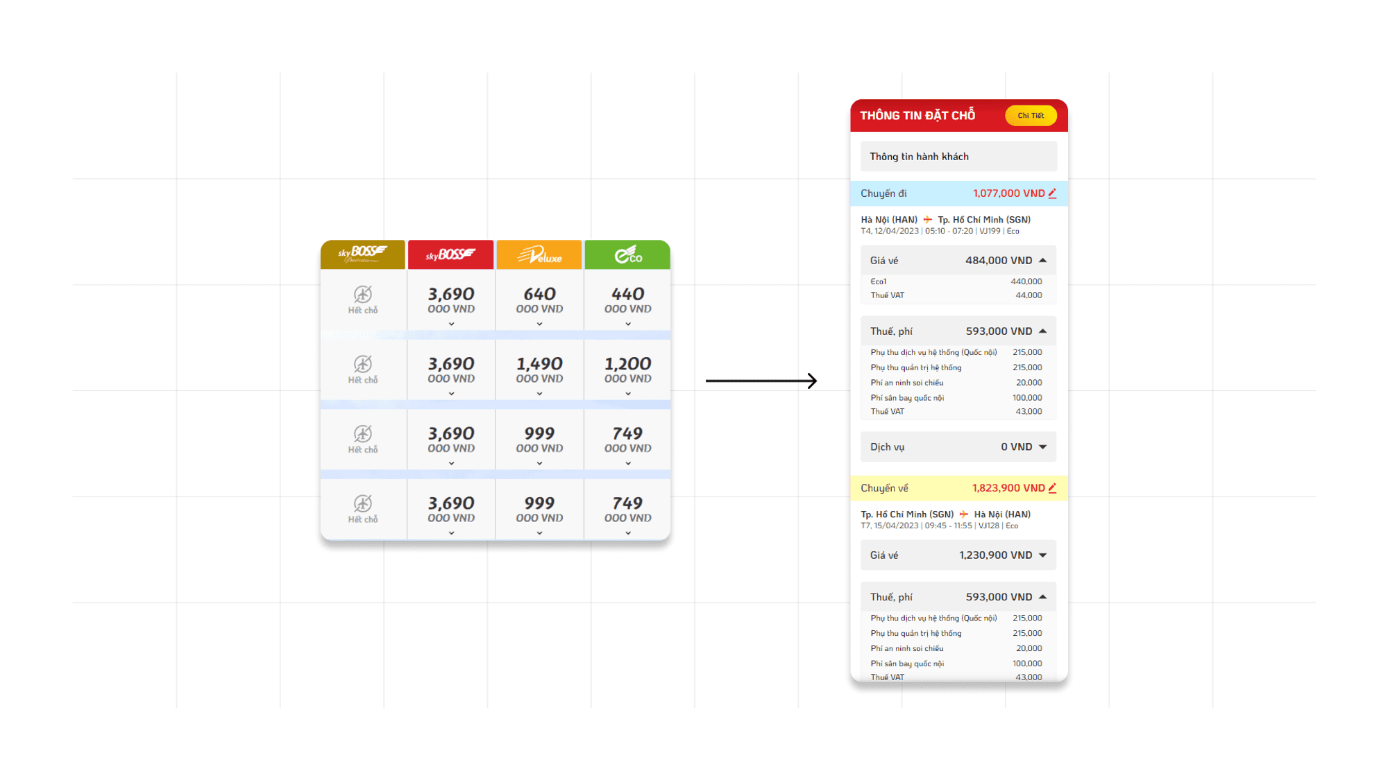
Provide a clear indication of price changes and updates throughout the booking process.
Clear status between Outbound and Inbound screens.
Highlight low-price tickets. </aside>
Psychology review
🔏 We applied the Psychology Review to address the factors behind the users’ behaviors.
And these factors are:
Users don't understand why they have to pay extra for choosing a seat on an airplane.
There is a concern among users that the food on the airplane is not of good quality, yet the price is high.
Users have difficulty estimating the appropriate weight limit for their family's luggage.
Some users believe that they have already brought enough 7kg of hand luggage and do not need to purchase more.
Choosing services for each member when traveling in a group is quite time-consuming.
Recommendations
Provide some statistics on the number of people purchasing services.
Use promotional images of people enjoying meals on the plane to create a sense of excitement.
Display food quality testimonials
Send service purchase reminders based on actual needs.
Inform users about the prices of luggage purchased directly before the flight, so that they can compare prices when buying in advance versus buying at the airport. </aside>
Mockup and Prototype
Highlight flow

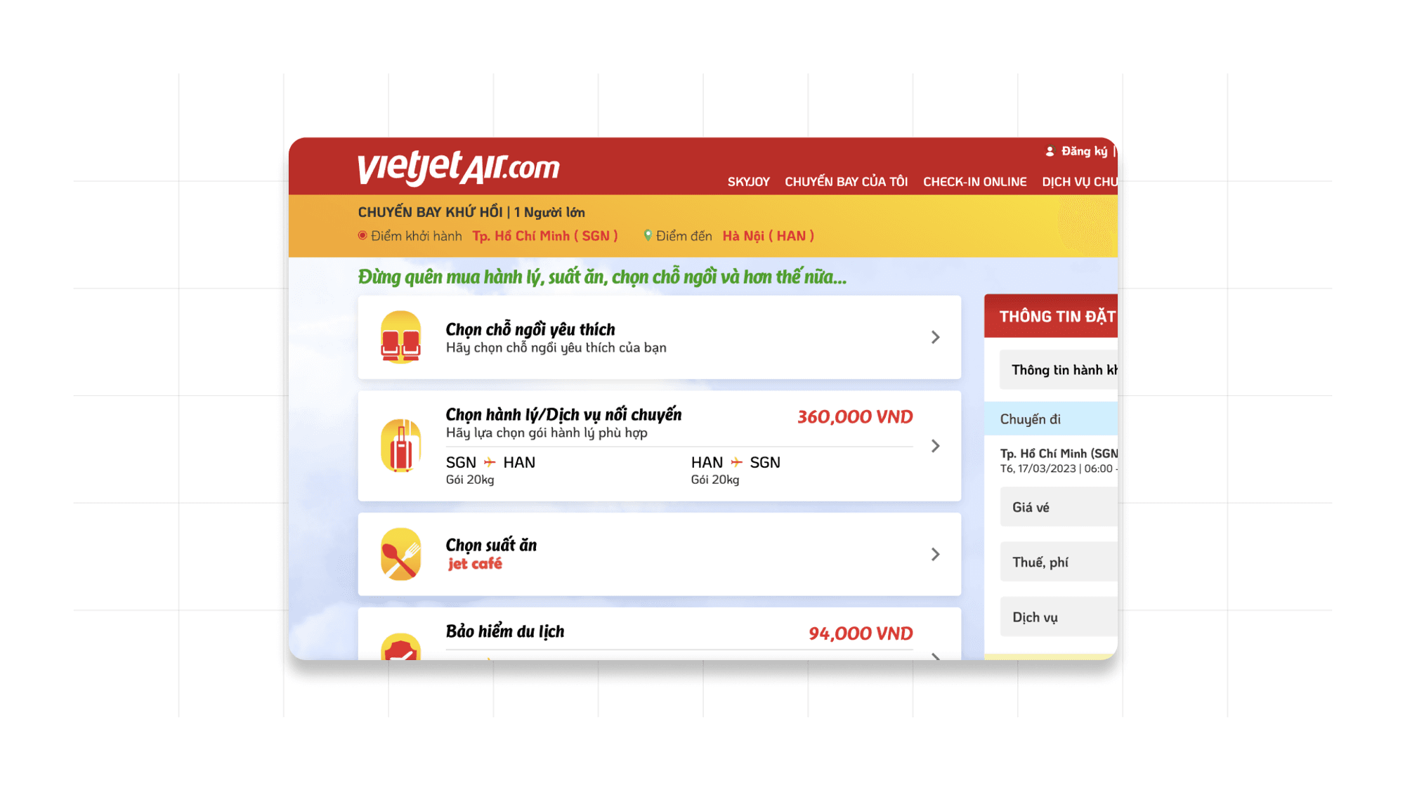
We make a major tweak to the flow, to sell more services, instead of just letting the user choose which service suits them, we walk them through all the service purchase screens of Vietjet Air for promotion opportunities. Of course, we still allow user to Skip through.
Highlight screens
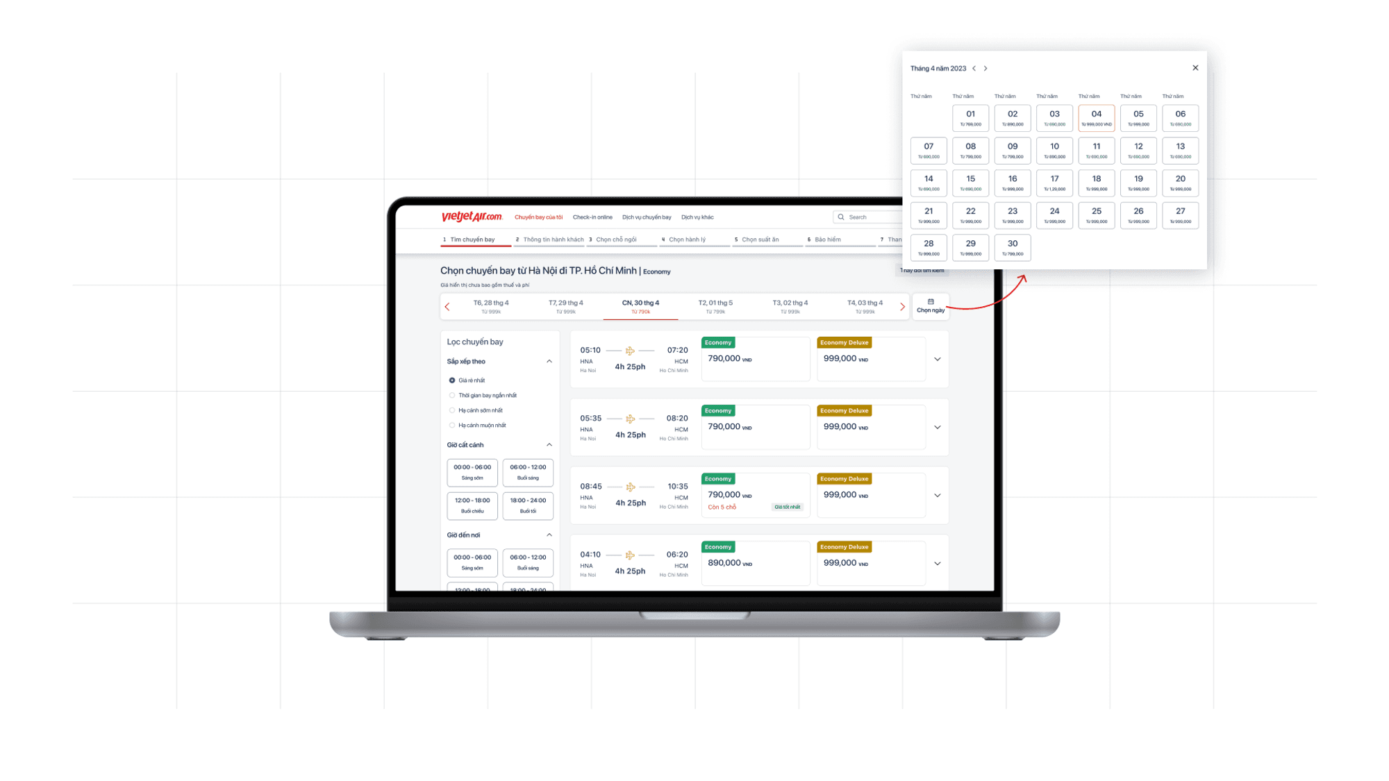
Searching for flights
Low fare calendar
Flight filter
Tags (e.g: “5 seats left”, “Best price”) - Scarcity effect
🧠 Scarcity effect
When people think that something is rare or only available for a limited time, they will tend to act fast to secure that scarce item.
Entering passengers’ information
Separating section of contact information
Optimizing options and placeholders
Auto updating contact information
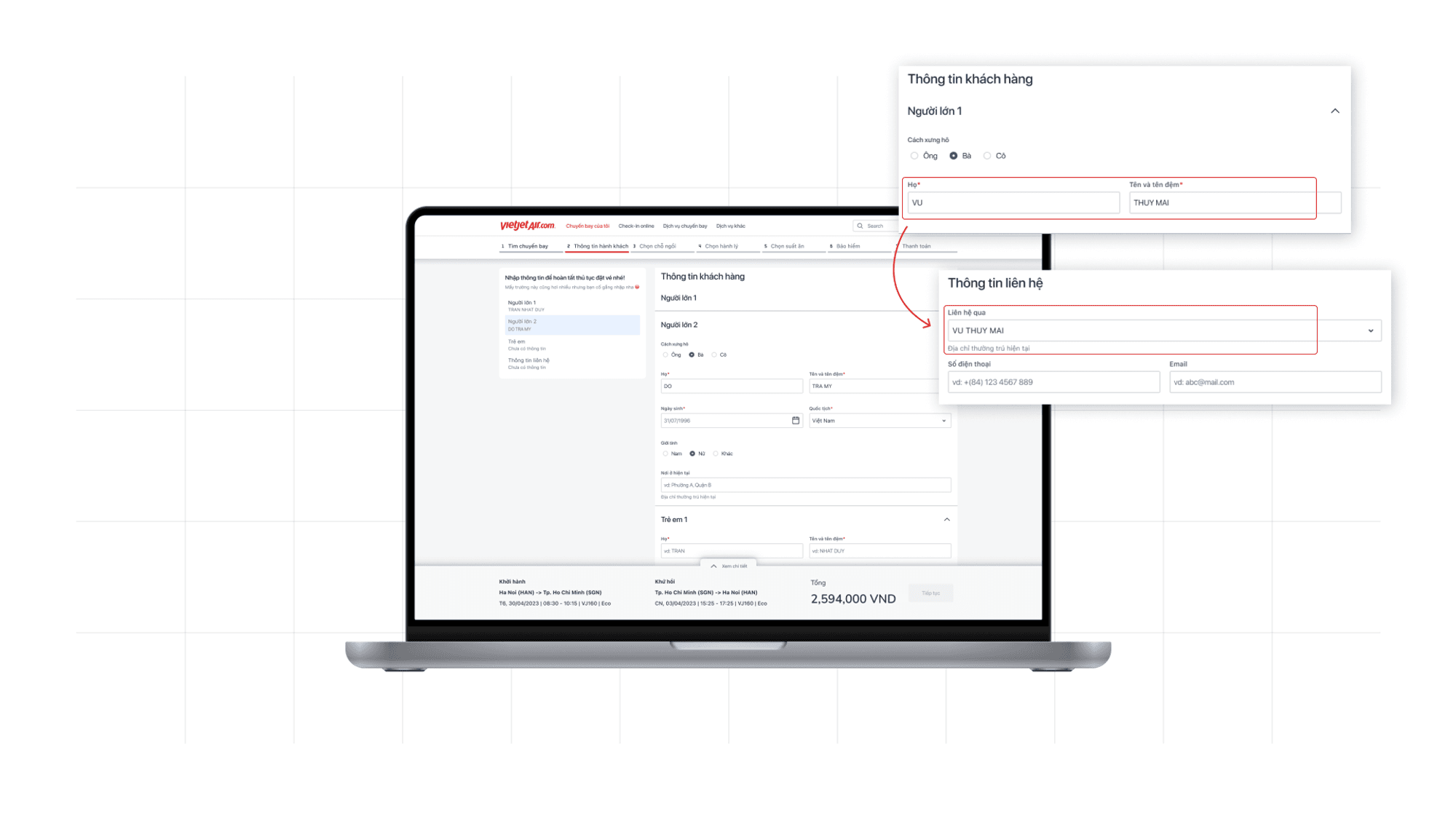
Transparent fare changes
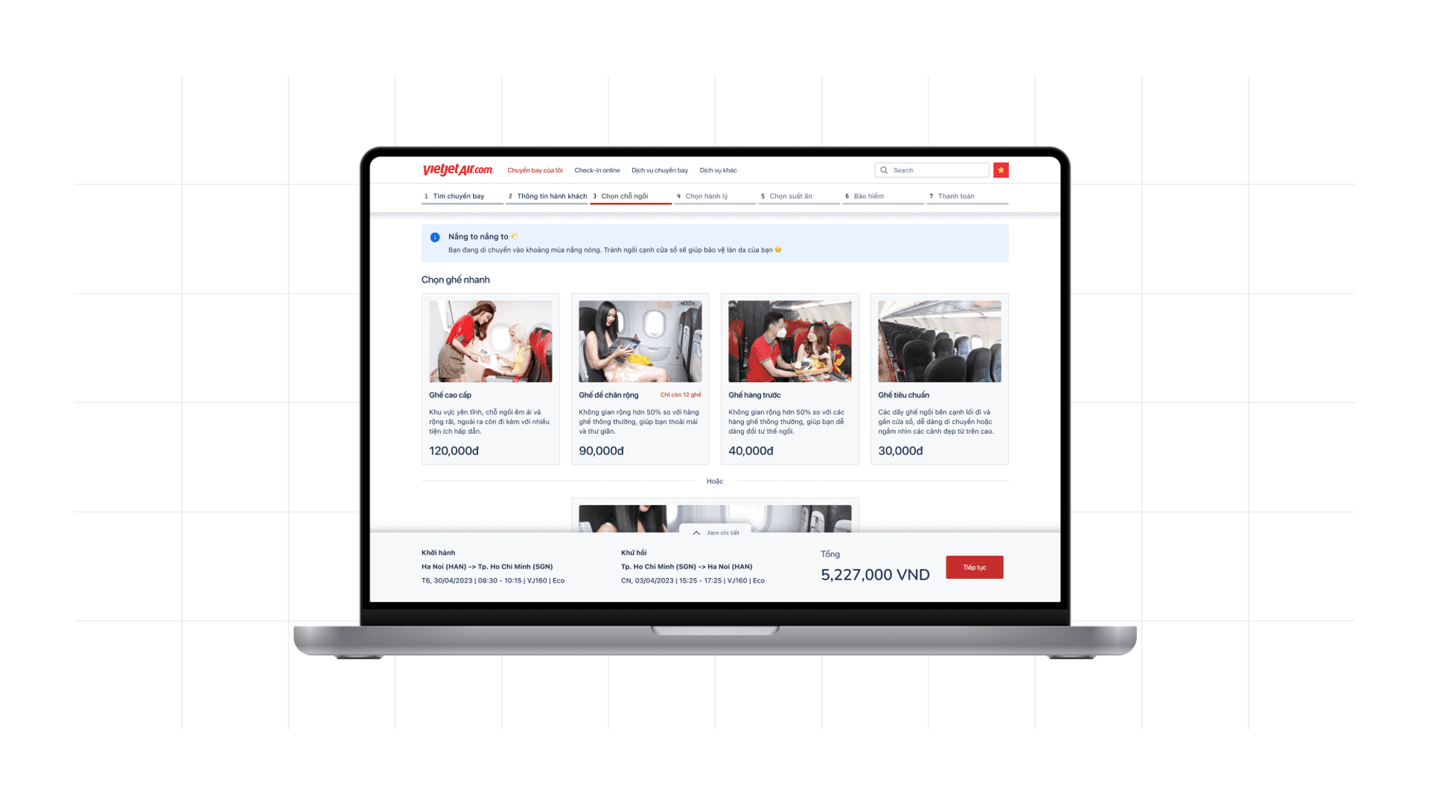
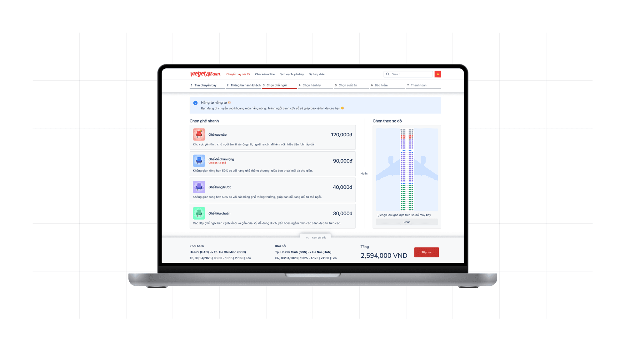
Seat purchasing
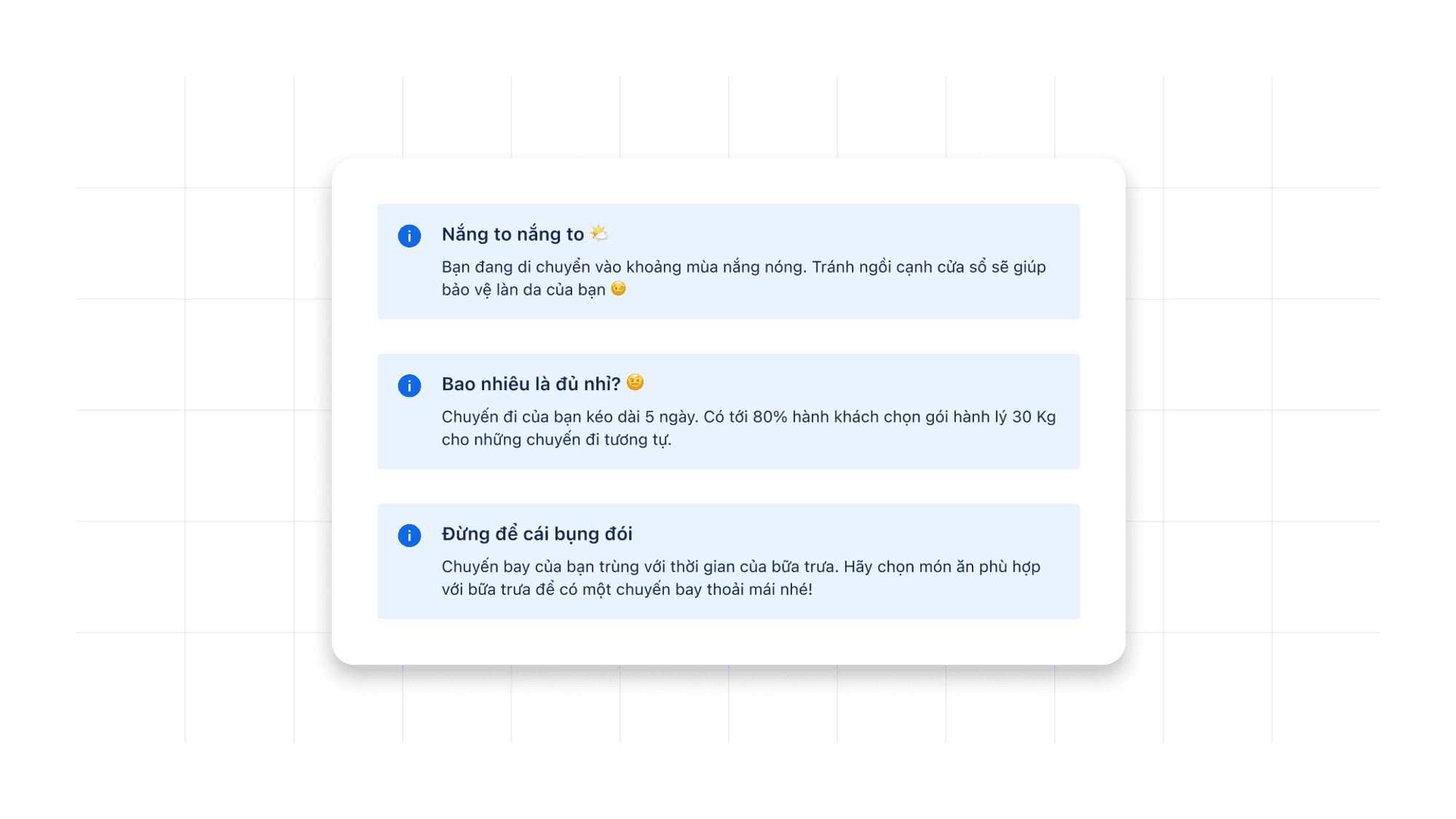
Weather-based suggestion
Using icons to separate types of seat
Quick select & Manual select option

Multi-select
Quick move between airbus’s sections
Auto-select based on user’s preference

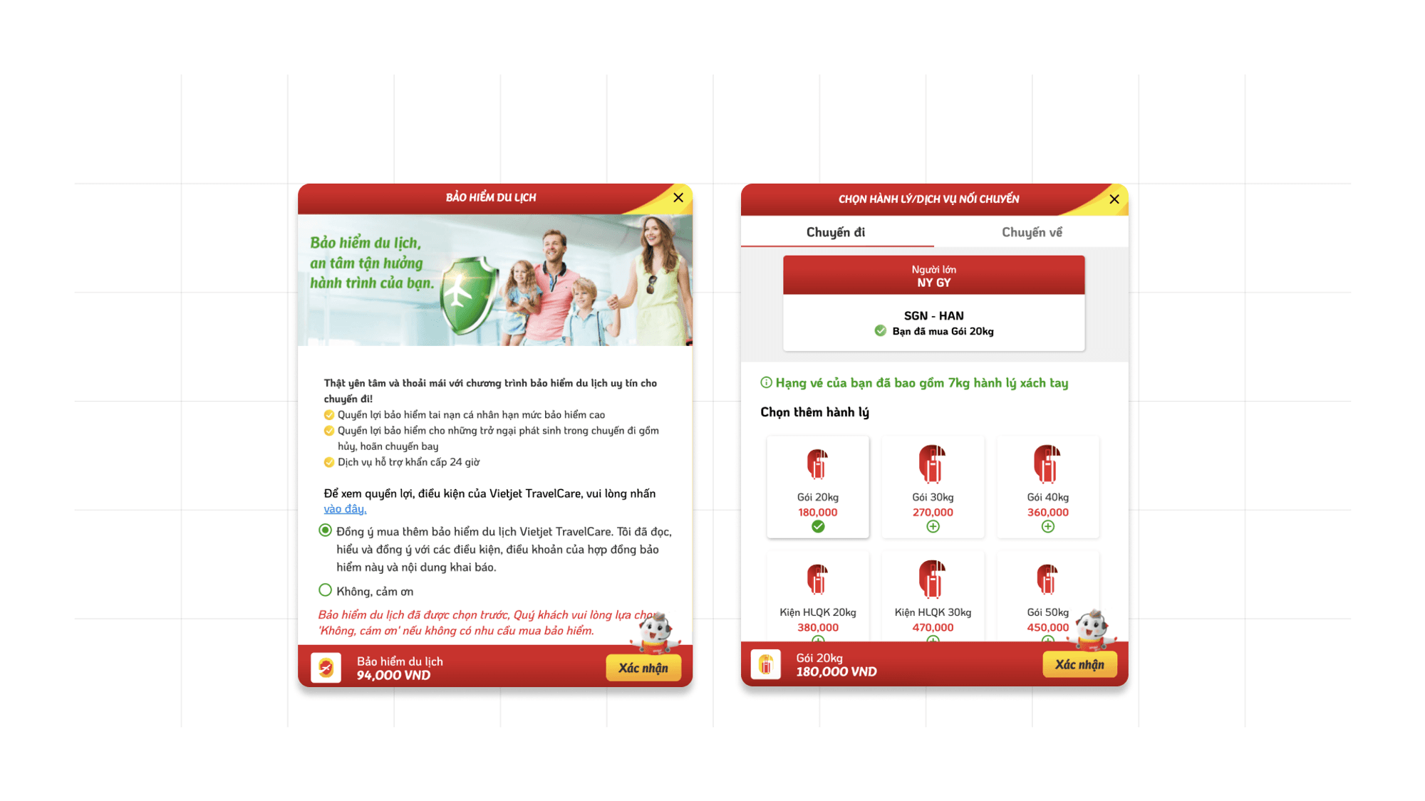
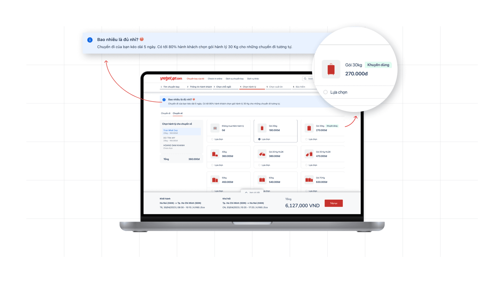
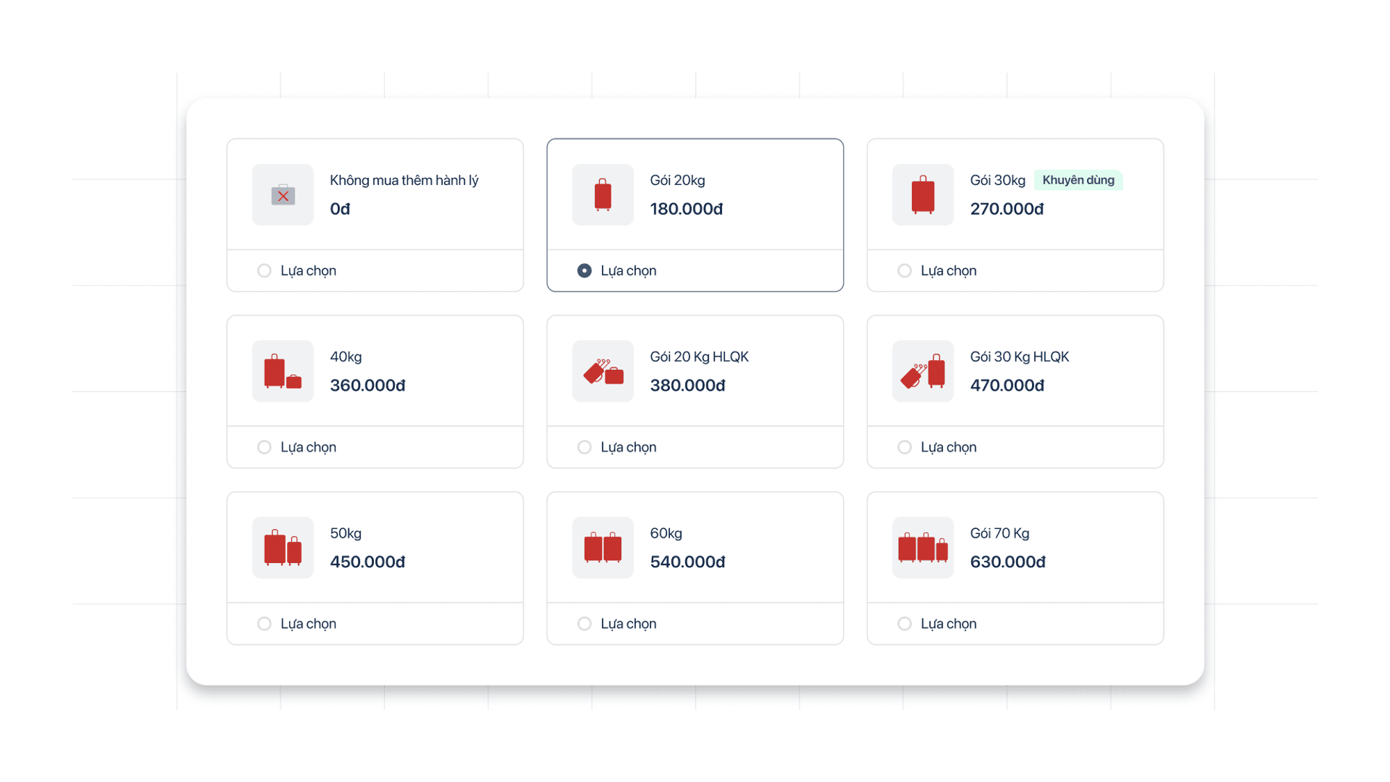
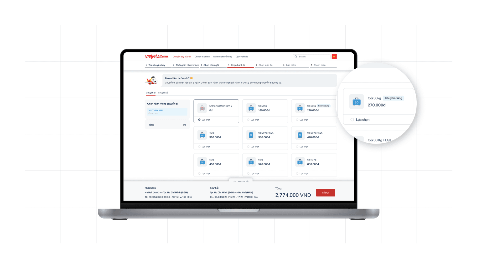
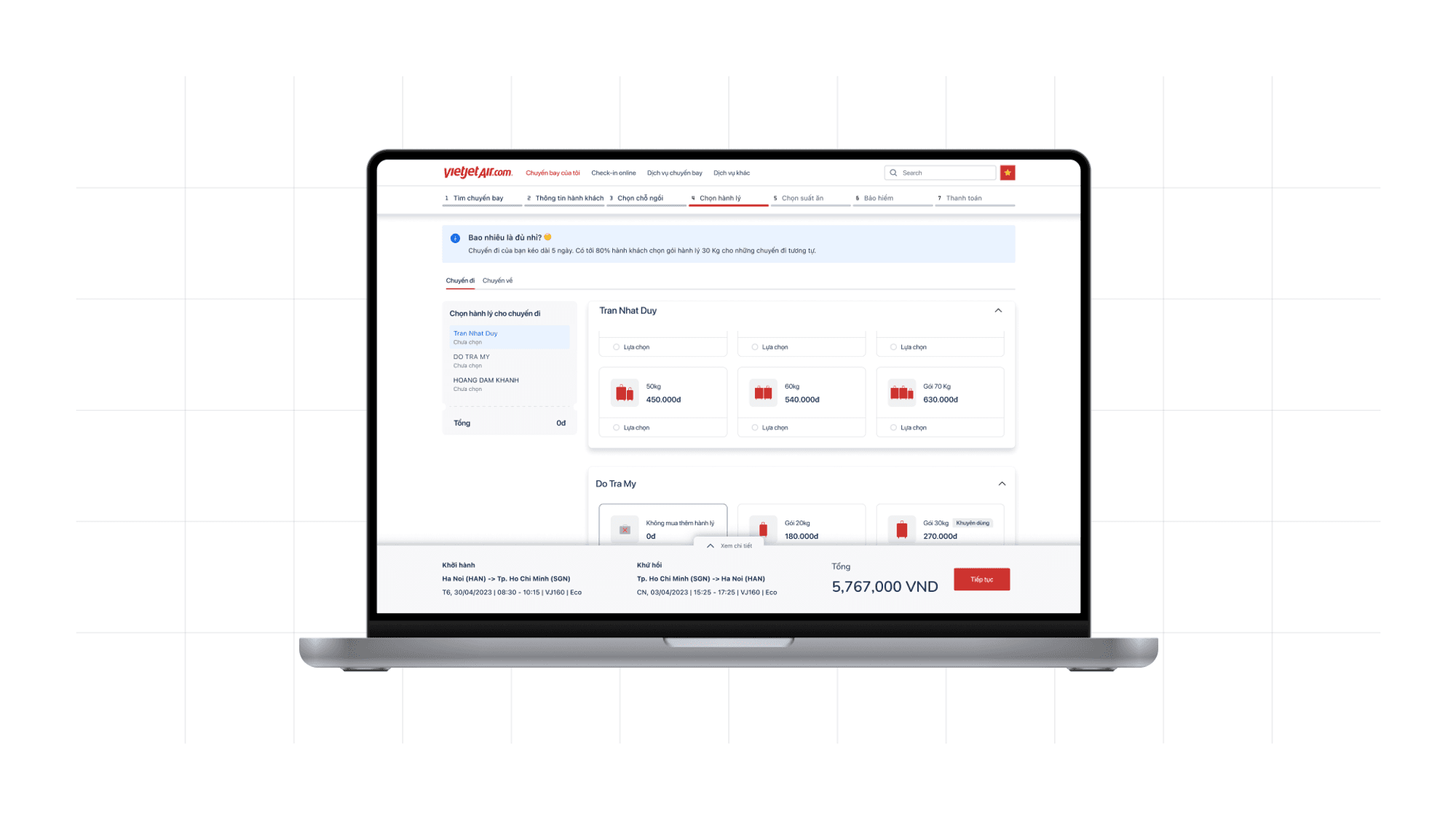
Luggage purchasing
Removing default dark pattern
Suggesting baggage based on trip length with statistical number, create Social Proof effect
🧠 Social Proof
People may influence by the choice of other. The greater the number of people, the more appropriate the action seems.
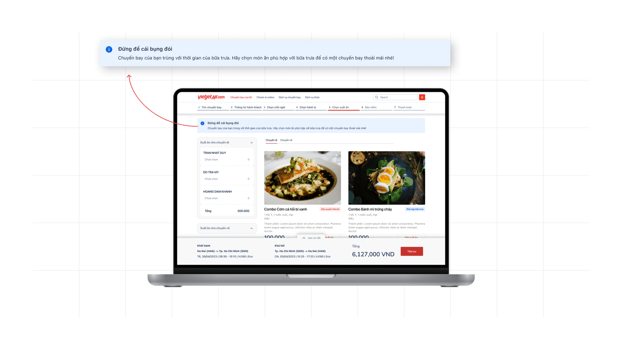
Meal purchasing
Allowing users to choose for multiple people, multiple meals, multiple flights, at the same time
Suggesting special meals
Suggesting meals based on flight time (show user that the Airline is cared for their health)
Insurance purchasing
Removing default dark pattern
Highlighting the benefits of insurance (consequences will be covered by insurance) - Loss aversion
Transparent insurance price
🧠 Loss aversion
Loss aversion refers to an individual’s tendency to prefer avoiding losses. In the case of insurance, the loss is time, health, money,…

Premium upgrading
Upsell by highlighting low extra fares with high benefits

Booking successfully
Suggestions for additional purchases after the user has completed the main task

Testing
Usability Testing with Prototype
Users find it easy to interact
Just press “Continue” to go through the steps
Users can find the cheapest fares
Understand how to use the “Cheapest” filter
Get the cheapest price based on the date picker tab

Users realize the benefits of upgrading

Users misunderstand seat purchase
Do not understand the types of seats
Misunderstand as ads (Banner blindness effect)
🧠 Banner blindness
People’s tendency to ignore page elements that they perceive (correctly or incorrectly) to be ads. Modern human cognitive already suffocate with high-quality picture on many advertise and banner.

Users misunderstand luggage purchase
Misunderstand icons as the number of pieces of luggage to be carried
Users don't know how to change tabs to choose services for other passengers

The selection suggestions are not easy to recognize
Design Critique
Users may find it time-consuming going through all the steps
Is it time-consuming to divide additional services into different steps for the user to go through?
Do users misunderstand that these services are required to be purchased before proceeding?

Design revamp
Users misunderstand seat purchase
Use icons & colors to categorize chairs, reducing distractions caused by images
Clearly distinguish 2 options "Quick select" & "Manual select”
Users misunderstand luggage purchase
Change the illustrations of luggage types to be more consistent and easy to read
Users don't know how to change tabs to choose services for other passengers
Divide the selection for each passenger into scrollable sections
The selection suggestions are not easy to recognize
Change the display of suggestions to a more personalized format by incorporating the brand mascot as a highlight

Users may find it time-consuming going through all the steps
Inform users that they have the option to skip to checkout

Conclusion
Key Learning
We have gained valuable insights throughout this project, and this knowledge motivates us to continue exploring and practicing in the field of UX.
Applying psychological and behavioral models creates a meaningful user experience.
Conducting usability testing in the right way can reveal limitless insights and opportunities for improvement.
Even the most promising solution is just a hypothesis, and it is vital to take into account the facts, options, and emotional state in every argument.
When the design team follows a correct UX method and process, the outcome can be implemented more efficiently and with less ambiguity.
Small experiences matter.
Creativity is not limited to anything; it can be applied to even the most technical aspects of UX design.
Next Steps
Design is a never ending process, there still many things we want to continue with this project.
Define the key metrics that can be used to measure the impact of the new design.
New features: Notification for price changes and services.
Expand the research to include other personas to explore more comprehensive solutions.
⏹️ Reference
https://growth.design/psychology
https://thedecisionlab.com/biases
and more from UX Foundation’s Psychology of UX Design course document.
Overview
Let’s talk about VietJet Air
VietJet Air is the first private airline in Vietnam, targeting customers who need to travel at a low cost.
VietjJet Air’s long-term goal is to become a multinational airline group with a wide network of flights throughout the region and the world, and to be a brand loved and trusted by customers.
So what happened with this “beloved” airline
Despite its great vision and a cool mascot, this brand is receiving no mercy from the market.
Many competitors
The airline is facing stiff competition from new domestic airlines like Bamboo Airways and Vietravel Airlines, as well as foreign airlines such as Turkish Airlines, Malaysia AirAsia, Edelweiss Air, and Air Seoul Inc. This has made price competition no longer viable.
Inefficient resources spent for sale campaign
Being a low-cost carrier brand, VietJet Air runs several major sales campaigns throughout the year, such as during Tet holiday and summer travel. However, the expenses associated with these discount activities consume a significant portion of the budget.
Difficult sale on additional services
Additional services such as purchasing luggage, seats, meals, and priority check-in can provide a significant source of revenue for the airline. However, the percentage of customers opting for these services is relatively small.
Limited search results
The "book-to-look" ratio is limited on the search results page, which makes it difficult for users to compare the results and make informed booking decisions.
Our goal
Given the airline's significant investment in sales campaigns and price competition with competitors, we were in need of a cost-effective solution that would satisfy the business needs and be simple to implement.
Persona
Before delving into the airline's issues, let's take a moment to examine the target audience persona for VietJet Air.
Nguồn: UX Foundation. Persona được cung cấp bởi giáo viên để phục vụ quá trình thiết kế giải pháp.
Research - Discovery
“What wrong with the current booking process in the Website?”
To answer this question, we will be applying various design research methods.
Heuristic Evaluation
We experienced the booking process on the website ourselves, taking screenshots and identifying usability issues using Nielsen Norman’s 10 Usability Heuristics for User Interface Design.
Image resource: https://uxdesign.cc/10-usability-heuristics-every-designer-should-know-129b9779ac53
Based on our research, we have identified some critical usability problems, such as:
Too many decorative elements, which causes distraction for users when performing the main action.
Sneak-into-basket dark pattern
Misleading UI components
Unnotified errors
And approximately 50+ more…
Usability Testing
How we planned the Usability Testing (UT)
By mapping down the major concern problems from the Heuristic Evaluation session, we define some specific goals for each attribute follow by:
Discoverability: The ability that user can find the information they needed
Comprehension: The ability to understand the context, meaning of the screen and able to moving forward on the flow.
Learnability: The ability to adapt and learn new usage.
Orientation: The ability to navigate on the system, to moving forward and return.
Let’s take a look at our UT Goals:
Attributes #1: Discoverability
Guide:
Can users find the information they need?
Can users find information about the cheapest fares?
Goals:
Can users easily find where to book tickets?
Can users find a way to sign up for a SkyJoy Membership?
Can users find the cheapest ticket?
Can users find the airline's offers (during the booking process)?
Can users compare flight prices between flight times? (Same day or between dates)
Are users aware that the time-out time is 15 minutes?
Attributes #2: Comprehension
Guide:
Do users understand the meaning of the screen, the context in it, and what will need to be done next?
Do users understand what surcharges they are facing?
Goals:
Do users understand meal, baggage options and insurance are optional?
Does the user understand the context and operation on the flight selection screen? (date transfer, forward price, flight status/return)
Are users aware of the missing information (departure date, return date)?
Do users understand the information requirements in the personal information input screen?
Attributes #3: Learnability
Guide:
With a new experience, do users learn/remember how to use it? |
Goals:
Can the user remember the time-out time is 15 minutes?
Attributes #4: Orientation
Guide:
Can users navigate where they are? Do they know how to go forward/backward?
Goals:
Do users know if he or she is choosing a ticket for a single trip or a return trip?
Do users know which step they are in in the booking process?
Can the users easily navigate back away from the ad?
Attributes #5: Task success
Goals:
Did users complete the task?
Attributes #6: Satisfaction
Goals:
Do users feel satisfied after using it?
After complete define the research goal, we create some scenarios for user to interact on the website that can help answer our concern.
Scenario 1: Suppose you have a need to travel from Hanoi to Saigon next month with the cheapest fares on Vietjet Air's website system. You can decide for yourself the date of departure and return to Hanoi. Please go to Vietjet Air's website to book tickets.
Scenario 2: Suppose you need to book a return ticket from Hanoi to Dalat for a family trip next month. You need to book tickets for yourself and 2 family members (including 1 small member under 2 years old). How do you find and book flight tickets to get the cheapest fares with additional services?
Participants
To get some practical data of user behavior on the VietJet Air website, we conduct Usability Testing with 5 participants that match our persona.
🙋♂️ H. C. T
Age: 21
Career: Student
Occasionally organize vacation trips and book airline tickets for the family.
🙋♀️ Q. A.
Age: 34
Career: Freelance Business
Mother of three kids, regularly organize vacation trips for families with many young children.
🙋♂️ Q. S.
Age: 27
Career: Graphic Designer
Planning vacation trip for family using third party booking platform.
🙋♀️ M. H.
Age: 36
Career: Saleswoman
Regularly book flight tickets for family and relatives, have experience in booking tickets on Vietjet Air 3 years ago.
🙋♀️ M.P.
Age: 22
Career: Student
Regularly move between Hanoi and Ho Chi Minh for school and study.
How we conduct the UT session
Due to the distance across team members as well as interviewees, we decided to conduct Remote Moderated Usability Tests through Google Meet.
In each session, one of us worked as the facilitator, while the other two took notes on users’ struggles and feedback for the facilitator.
Results
Uh oh, it seems that users didn't have a good experience with the current website. Here are a few quotes from our participants:
Research - Define
Analyze research data
After collecting all the research findings, we analyzed them using Affinity Diagramming, a collaborative method in which we placed all the observations, findings, etc. on sticky notes in FigJam and grouped them accordingly.
Each group represents the problems that users are experiencing when using the VietJet Air website.
Key problems
Users don't know how to filter for low-cost tickets
Features are not clearly explained.
Access to this feature is limited.
UI design makes it likely for users to ignore this feature.
Users are forced to use a lot of memory load when choosing between numerous different options.
🧠 Memory load
Can be called Cognitive Load, just like computers, human brains have a limited amount of processing power. When the amount of information coming in exceeds our ability to handle it, our performance suffers. We may take longer to understand information, miss important details, or even get overwhelmed and abandon the task.
Users don't understand why the fare increases with each step
Service fees and taxes are not clearly explained.
Through the steps, the change in the invoice is not highlighted, causing users to often ignore it.
Users don’t know they can customize the additional services
Users hardly realize that they can customize the service options that come with it.
UI design makes it difficult for users to interact with options.
Some additional services are selected by default, this could cause Reactance effect.
The Uncheck option is hidden.
🧠 Reactance
If user feel something is taking away their choices or limiting the range of alternatives. It'll trigger an opposite response to what was intended, and also increases resistance to persuasion, this could lead to abandonee the process or even abandonee the brand.
Main objectives
Improving the ticket booking experience on the website
Increasing the need to purchase additional services.
Design - Develop
Competitive analysis
Here is the list of our competitors, including domestic and foreign airlines, as well as third-party booking services.
Vietnam Airlines
Jetstar Pacific Airlines
Bamboo Airways
Vietravel Airlines
Traveloka
Turkis Airlines
Malaysia Airline
Edweiss Airline
Full version available here: Competitive Analysis
Recommendations
For features
The collapsible/expanding footer that shows ticket information.
The calendar view that includes the lowest ticket price on each day.
Allow users to choose their desired ticket class from the beginning to help them filter their search and find the best option to suit their needs.
Allow sorting the order of flights according to users' needs.
For Design
Provide a clear indication of price changes and updates throughout the booking process.
Clear status between Outbound and Inbound screens.
Highlight low-price tickets. </aside>
Psychology review
🔏 We applied the Psychology Review to address the factors behind the users’ behaviors.
And these factors are:
Users don't understand why they have to pay extra for choosing a seat on an airplane.
There is a concern among users that the food on the airplane is not of good quality, yet the price is high.
Users have difficulty estimating the appropriate weight limit for their family's luggage.
Some users believe that they have already brought enough 7kg of hand luggage and do not need to purchase more.
Choosing services for each member when traveling in a group is quite time-consuming.
Recommendations
Provide some statistics on the number of people purchasing services.
Use promotional images of people enjoying meals on the plane to create a sense of excitement.
Display food quality testimonials
Send service purchase reminders based on actual needs.
Inform users about the prices of luggage purchased directly before the flight, so that they can compare prices when buying in advance versus buying at the airport. </aside>
Mockup and Prototype
Highlight flow
We make a major tweak to the flow, to sell more services, instead of just letting the user choose which service suits them, we walk them through all the service purchase screens of Vietjet Air for promotion opportunities. Of course, we still allow user to Skip through.
Highlight screens
Searching for flights
Low fare calendar
Flight filter
Tags (e.g: “5 seats left”, “Best price”) - Scarcity effect
🧠 Scarcity effect
When people think that something is rare or only available for a limited time, they will tend to act fast to secure that scarce item.
Entering passengers’ information
Separating section of contact information
Optimizing options and placeholders
Auto updating contact information
Transparent fare changes
Seat purchasing
Weather-based suggestion
Using icons to separate types of seat
Quick select & Manual select option
Multi-select
Quick move between airbus’s sections
Auto-select based on user’s preference
Luggage purchasing
Removing default dark pattern
Suggesting baggage based on trip length with statistical number, create Social Proof effect
🧠 Social Proof
People may influence by the choice of other. The greater the number of people, the more appropriate the action seems.
Meal purchasing
Allowing users to choose for multiple people, multiple meals, multiple flights, at the same time
Suggesting special meals
Suggesting meals based on flight time (show user that the Airline is cared for their health)
Insurance purchasing
Removing default dark pattern
Highlighting the benefits of insurance (consequences will be covered by insurance) - Loss aversion
Transparent insurance price
🧠 Loss aversion
Loss aversion refers to an individual’s tendency to prefer avoiding losses. In the case of insurance, the loss is time, health, money,…
Premium upgrading
Upsell by highlighting low extra fares with high benefits
Booking successfully
Suggestions for additional purchases after the user has completed the main task
Testing
Usability Testing with Prototype
Users find it easy to interact
Just press “Continue” to go through the steps
Users can find the cheapest fares
Understand how to use the “Cheapest” filter
Get the cheapest price based on the date picker tab
Users realize the benefits of upgrading
Users misunderstand seat purchase
Do not understand the types of seats
Misunderstand as ads (Banner blindness effect)
🧠 Banner blindness
People’s tendency to ignore page elements that they perceive (correctly or incorrectly) to be ads. Modern human cognitive already suffocate with high-quality picture on many advertise and banner.
Users misunderstand luggage purchase
Misunderstand icons as the number of pieces of luggage to be carried
Users don't know how to change tabs to choose services for other passengers
The selection suggestions are not easy to recognize
Design Critique
Users may find it time-consuming going through all the steps
Is it time-consuming to divide additional services into different steps for the user to go through?
Do users misunderstand that these services are required to be purchased before proceeding?
Design revamp
Users misunderstand seat purchase
Use icons & colors to categorize chairs, reducing distractions caused by images
Clearly distinguish 2 options "Quick select" & "Manual select”
Users misunderstand luggage purchase
Change the illustrations of luggage types to be more consistent and easy to read
Users don't know how to change tabs to choose services for other passengers
Divide the selection for each passenger into scrollable sections
The selection suggestions are not easy to recognize
Change the display of suggestions to a more personalized format by incorporating the brand mascot as a highlight
Users may find it time-consuming going through all the steps
Inform users that they have the option to skip to checkout
Conclusion
Key Learning
We have gained valuable insights throughout this project, and this knowledge motivates us to continue exploring and practicing in the field of UX.
Applying psychological and behavioral models creates a meaningful user experience.
Conducting usability testing in the right way can reveal limitless insights and opportunities for improvement.
Even the most promising solution is just a hypothesis, and it is vital to take into account the facts, options, and emotional state in every argument.
When the design team follows a correct UX method and process, the outcome can be implemented more efficiently and with less ambiguity.
Small experiences matter.
Creativity is not limited to anything; it can be applied to even the most technical aspects of UX design.
Next Steps
Design is a never ending process, there still many things we want to continue with this project.
Define the key metrics that can be used to measure the impact of the new design.
New features: Notification for price changes and services.
Expand the research to include other personas to explore more comprehensive solutions.
⏹️ Reference
https://growth.design/psychology
https://thedecisionlab.com/biases
and more from UX Foundation’s Psychology of UX Design course document.