Fintech
Case Study: Mono Design system - How I help my teammates leave on time
Case Study: Mono Design system - How I help my teammates leave on time
Dec 8, 2022
Dec 8, 2022
My role
Design System creator & manager: Dam Khanh Hoang
Overview
In the mid of 2022, I started a new job at Moonlab as an UX/UI Designer. Our product design team has 5 members, who are responsible for designing blockchain projects. I am the youngest member among others who, I believe, are from an older designer generation, which is both an opportunity for me to learn from so experienced designers, but also a challenge for me as they did not work in the same way as I do.


Problem(s)
No systematic organization Things started when during my first month, I often observed my teammates staying late, even until mid-night to finish their tasks. Later, I figured out our team did not have any protocols to follow, and every decision was made manually and intuitively. This resulted in regular nights and weekends spent on making small changes (on all pages) and enormous effort to keep the design consistent.
Lack of consistency across multiple baby projects Since we are an outsourcing unit working on blockchain projects, our team have to keep track of a lot of small projects inside brands’ eco-system. One small request from the client, such as changing a hue, can easily turn into a nightmare for our team since the rules were not clearly defined in the early stage.
Lack of teamwork We handle a lot of projects, which keeps us busy the whole week (I mean the whole 7 days). Every time our team starts a new project, the designer who is responsible for it would build the style guide along with their design process for his/her personal use only, making it challenging for others who wish to give a hand.
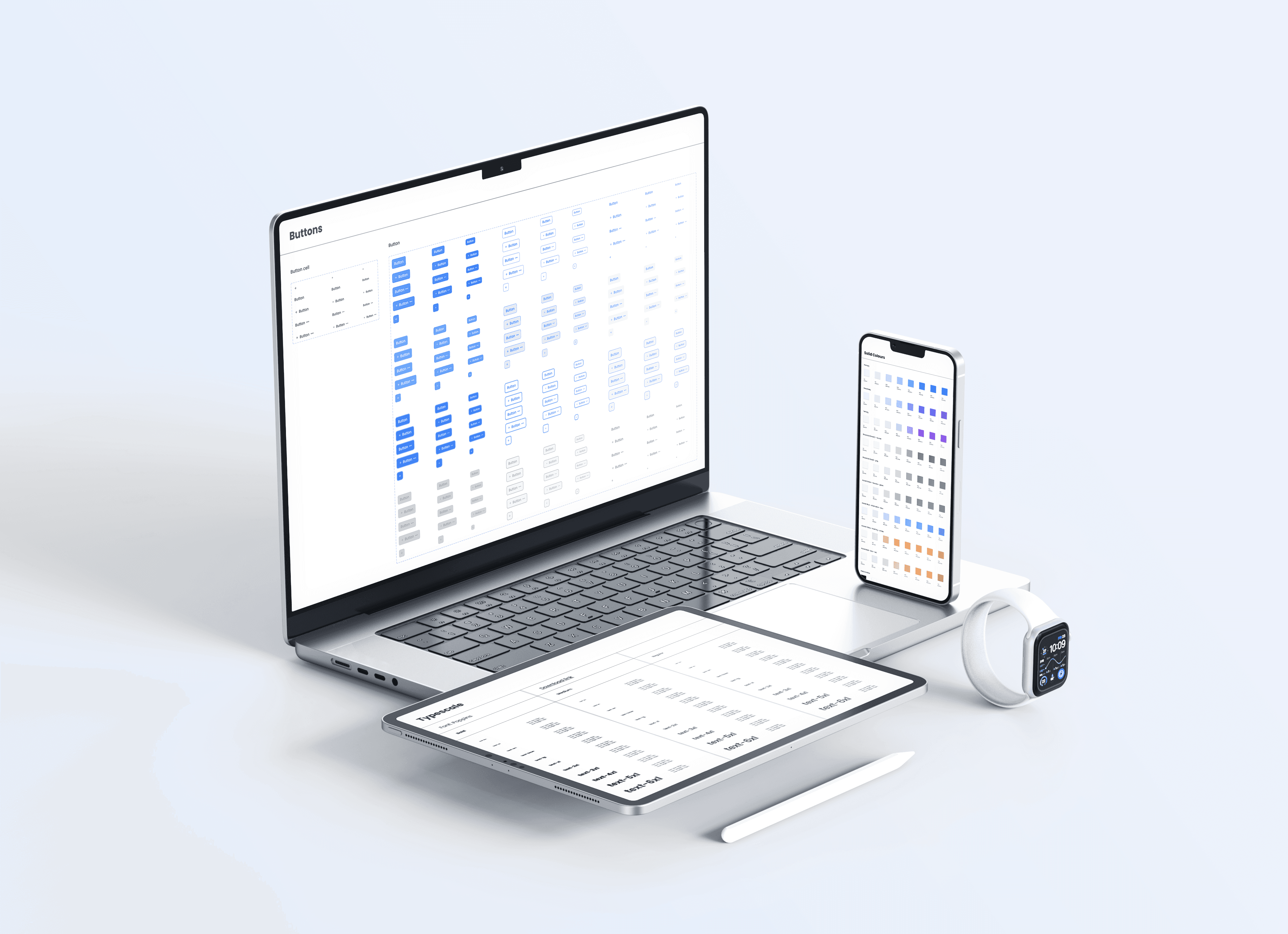
In short, our team lacked a foundational Design system that can be adopted, developed and customized for different projects.
Details
Research
Research objectives
Understand how popular Design systems, such as Material 3 Design System, Carbon Design System or Human Interface Guidelines are built.
Understand requirement of our design team.
Understand requirement of our development team.
Key findings
Key Finding #1: Our design team need a basic system that can be easily customized for each project. ⇒ By understanding this, I have reduced and simplified the set of visual styles as well as components to keep the Design system sufficient, but also straight-forward enough.
Key Finding #2: Our developers build based on Tailwindcss library ⇒ By understanding this, I have referred to the system to generate and name styles that can be easily recognized and customized by our developers.
Mono Design System
Stage 1: Building Visual style
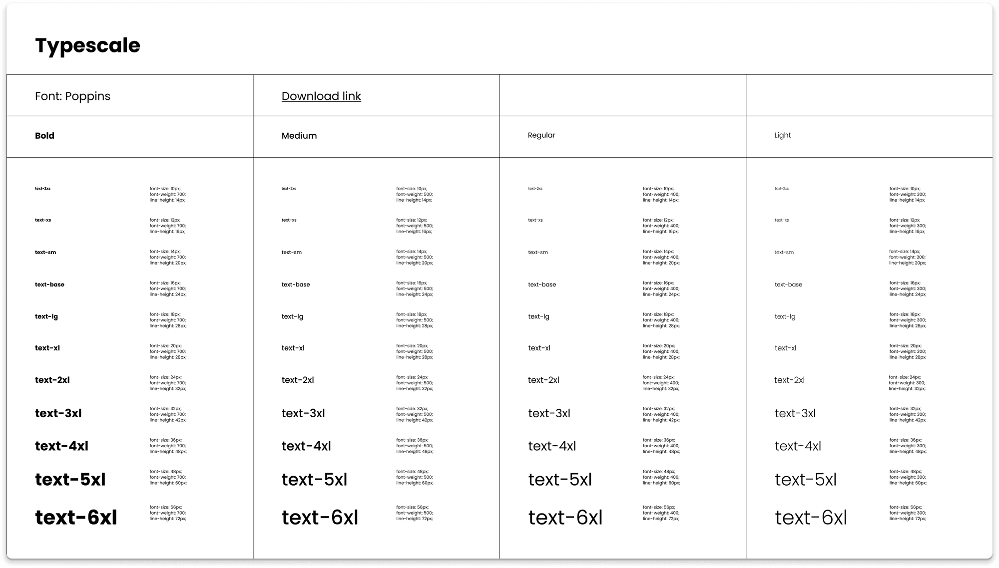
I started with the Typography system, which my team considers the soul of our products. What I figured out was I should manually set the line height for each font size, rather than using fixed formula to generate it. The reason is it makes the paragraph size contains decimals, which causes our developers having a hard time inspecting the design.
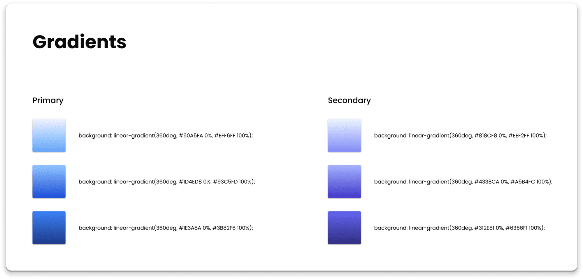
Then I started building the color palette, in which for each hue, there are 10 different tints and shades, named as 50 to 900. The gradient palette was generated based on the dominant colors.
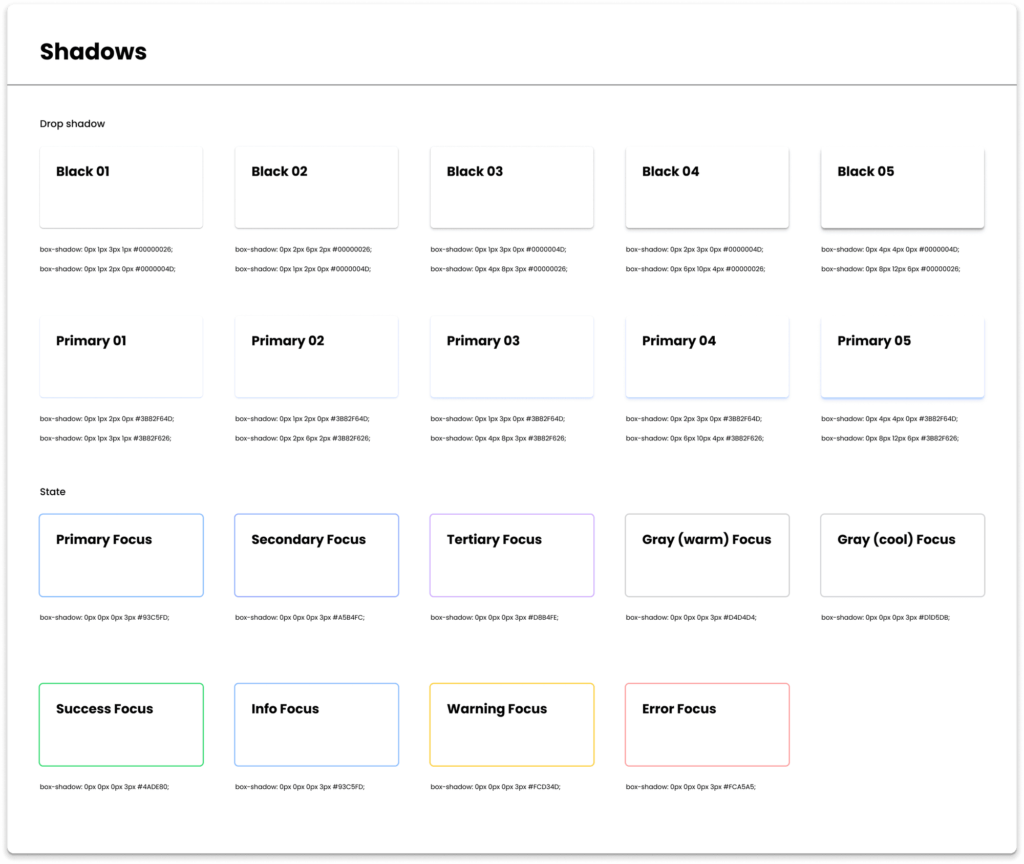
Lastly, I created a shadow guide, including drop-shadow effects and focus states.
Stage 2: Building components
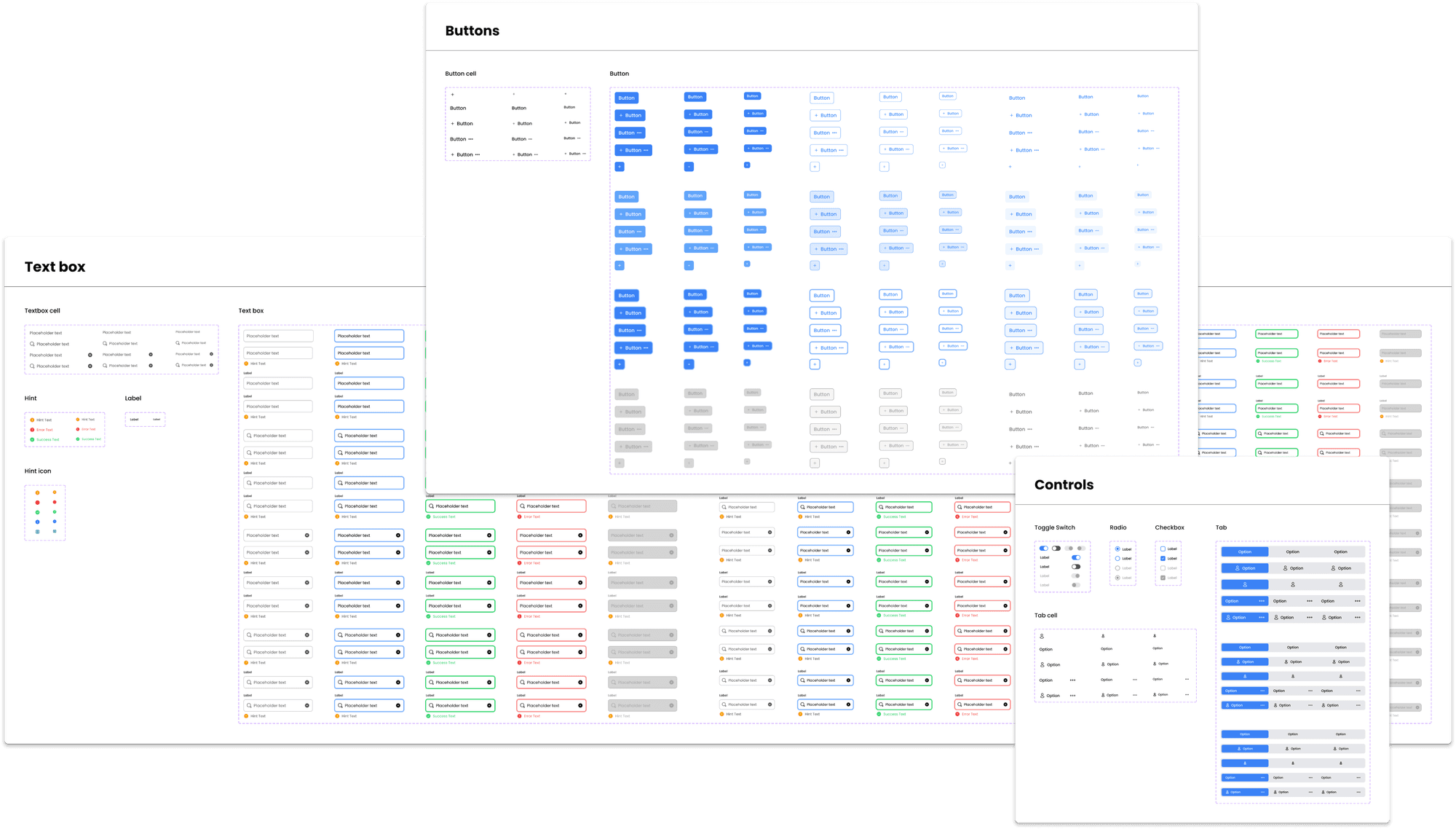
Since each of our project requires different sets of components, I limited the number of components to only the most essential ones to create freedom for our designers when developing from this base. In total, I have constructed 12 components and 806 variants.
Stage 3: Testing and Feedback
After the first publication of Mono Design system, I have received multiple feedbacks from both design team and development team. In general, my co-workers were fairly satisfied with the reduced effort on projects.
However, there were still components that are expected to show up in the Design system, which I am continuously considering and updating if necessary.
During this stage, I also provided trainings to my teammates to ensure they can make the most of my effort.
Result
Although there has not been any official measurement to show how effectively Mono Design system perform, I am happy to see my colleagues being able to leave office on time and being energized to keep fighting the next days.
In a nutshell
What I have learned from this project
Key learning #1: Do just enough At the first few steps, I got greedy and over-excited to show how much I could do, but later on I figured out that doing just what my team need is much more focus-worthy. Although Mono Design system is much less complex and fulfilled compared to that of other companies, but it well enhances the performance of my team without being too complicated.
Key learning #2: Fight, fall and stand up What I mean is to defend my own design decisions. While making the Mono Design system, I countered a lot of feedbacks, most of them were not quite positive. However, I did notice that protecting my own decisions is as important as keeping an open mind. Later in the project, I managed to settle with reasonable feedbacks, but also keep my decisions alive.
Problem(s)
No systematic organization Things started when during my first month, I often observed my teammates staying late, even until mid-night to finish their tasks. Later, I figured out our team did not have any protocols to follow, and every decision was made manually and intuitively. This resulted in regular nights and weekends spent on making small changes (on all pages) and enormous effort to keep the design consistent.
Lack of consistency across multiple baby projects Since we are an outsourcing unit working on blockchain projects, our team have to keep track of a lot of small projects inside brands’ eco-system. One small request from the client, such as changing a hue, can easily turn into a nightmare for our team since the rules were not clearly defined in the early stage.
Lack of teamwork We handle a lot of projects, which keeps us busy the whole week (I mean the whole 7 days). Every time our team starts a new project, the designer who is responsible for it would build the style guide along with their design process for his/her personal use only, making it challenging for others who wish to give a hand.
In short, our team lacked a foundational Design system that can be adopted, developed and customized for different projects.
Details
Research
Research objectives
Understand how popular Design systems, such as Material 3 Design System, Carbon Design System or Human Interface Guidelines are built.
Understand requirement of our design team.
Understand requirement of our development team.
Key findings
Key Finding #1: Our design team need a basic system that can be easily customized for each project. ⇒ By understanding this, I have reduced and simplified the set of visual styles as well as components to keep the Design system sufficient, but also straight-forward enough.
Key Finding #2: Our developers build based on Tailwindcss library ⇒ By understanding this, I have referred to the system to generate and name styles that can be easily recognized and customized by our developers.
Mono Design System
Stage 1: Building Visual style
I started with the Typography system, which my team considers the soul of our products. What I figured out was I should manually set the line height for each font size, rather than using fixed formula to generate it. The reason is it makes the paragraph size contains decimals, which causes our developers having a hard time inspecting the design.

Then I started building the color palette, in which for each hue, there are 10 different tints and shades, named as 50 to 900. The gradient palette was generated based on the dominant colors.

Lastly, I created a shadow guide, including drop-shadow effects and focus states.

Stage 2: Building components
Since each of our project requires different sets of components, I limited the number of components to only the most essential ones to create freedom for our designers when developing from this base. In total, I have constructed 12 components and 806 variants.

Stage 3: Testing and Feedback
After the first publication of Mono Design system, I have received multiple feedbacks from both design team and development team. In general, my co-workers were fairly satisfied with the reduced effort on projects.
However, there were still components that are expected to show up in the Design system, which I am continuously considering and updating if necessary.
During this stage, I also provided trainings to my teammates to ensure they can make the most of my effort.
Result
Although there has not been any official measurement to show how effectively Mono Design system perform, I am happy to see my colleagues being able to leave office on time and being energized to keep fighting the next days.
In a nutshell
What I have learned from this project
Key learning #1: Do just enough At the first few steps, I got greedy and over-excited to show how much I could do, but later on I figured out that doing just what my team need is much more focus-worthy. Although Mono Design system is much less complex and fulfilled compared to that of other companies, but it well enhances the performance of my team without being too complicated.
Key learning #2: Fight, fall and stand up What I mean is to defend my own design decisions. While making the Mono Design system, I countered a lot of feedbacks, most of them were not quite positive. However, I did notice that protecting my own decisions is as important as keeping an open mind. Later in the project, I managed to settle with reasonable feedbacks, but also keep my decisions alive.