Fintech
Case study: Neko Protocol - Helping users manage multiple mining machines
Case study: Neko Protocol - Helping users manage multiple mining machines
Dec 12, 1212
Dec 12, 1212
My role
UX Designer: Dam Khanh Hoang
UI Designer: Lai Hieu, Dam Khanh Hoang
Overview
NEKO Protocol is initiated by Proof-of-work Mining and Quiz-to-Earn activities.
To find out more, visit https://nekoprotocol.com/
Although the project covered a lot of functions, this case study only discussed the most remarkable and effortful function, which is Proof-of-work Mining.
PS: I worked on this project at my former outsourcing company. Sadly, after we hand over this project to our clients, they used it for unhealthy purposes without our knowings.


Challenge(s)
✍🏻 My first time designing for POW (Proof of Work) Earning Although I have worked in FinTech in general and blockchain in particular for a while and contributed to various projects on Decentralized Exchange, this was the first time that I work on a POW Earning project. Moreover, my responsibility for this project offered me more chance for making design decisions, but also required much more research and problem solving skills.
Research
Research objective
Understand what information miners need to know when investing and managing a Cloud mining services.
Understand what motivates miners when managing the mining machines.
Key findings
Key Finding #1: Miners need to know Mining speed, duration, price of a Cloud mining machine in order to consider invest ⇒ By understanding this, I have discussed with the development team if it is possible to provide miners the required information to make their investment process more transparent and easy to understand.
Key Finding #2: While managing mining machines, miners constantly check remaining time and amount earned. ⇒ By understanding this, I have paid attention to make these information more noticeable in the design.
Key Finding #3: Users pay extra attention on securing their digital assets ⇒ By understanding this, I have considered providing users additional option to protect their money.
Design Solution
Managing the mining machines
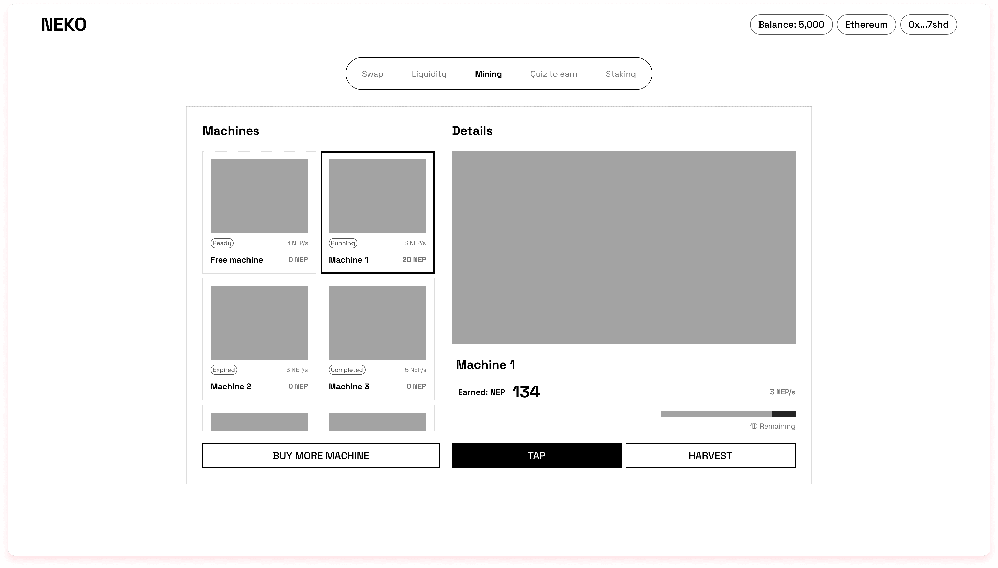
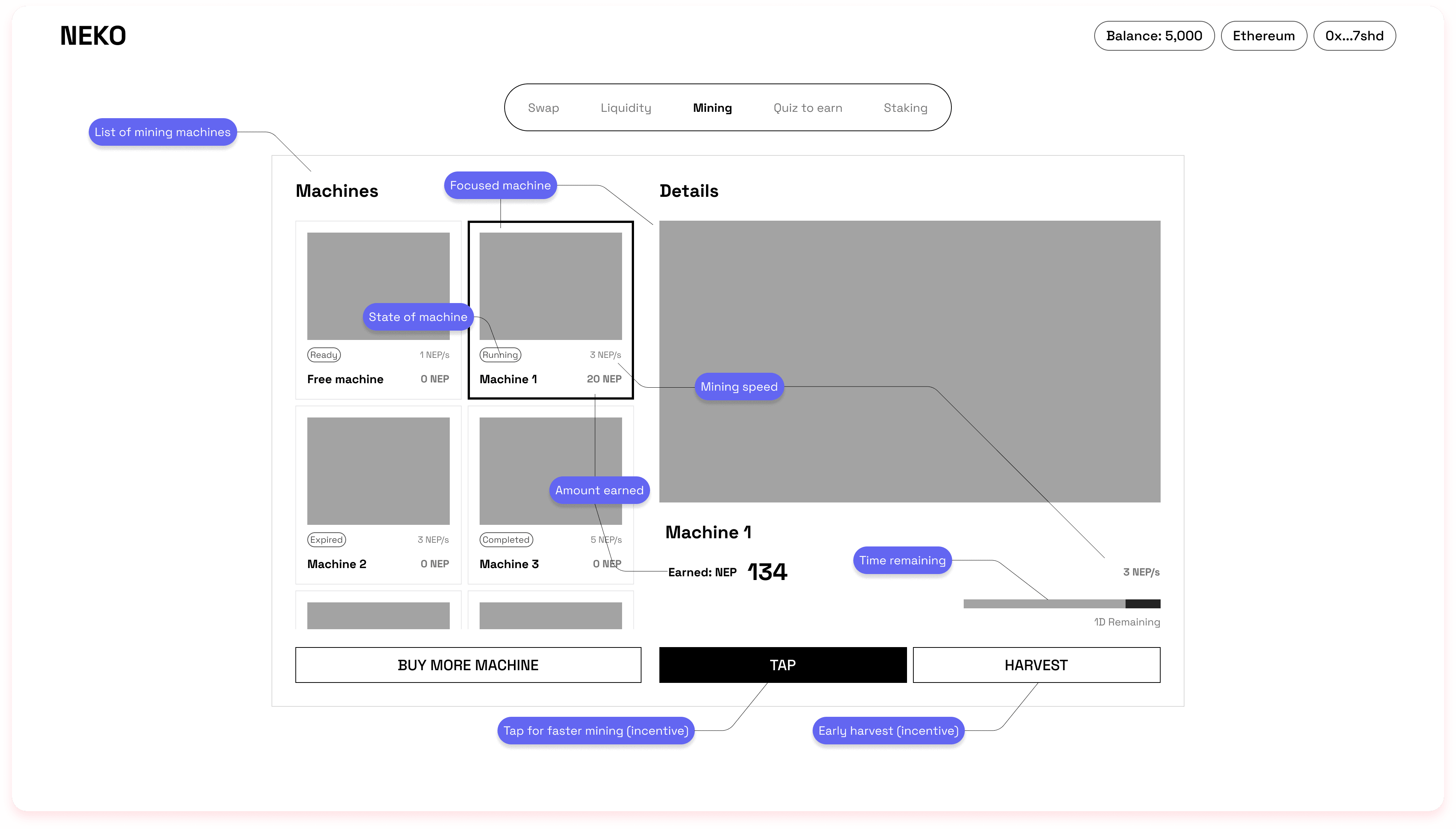
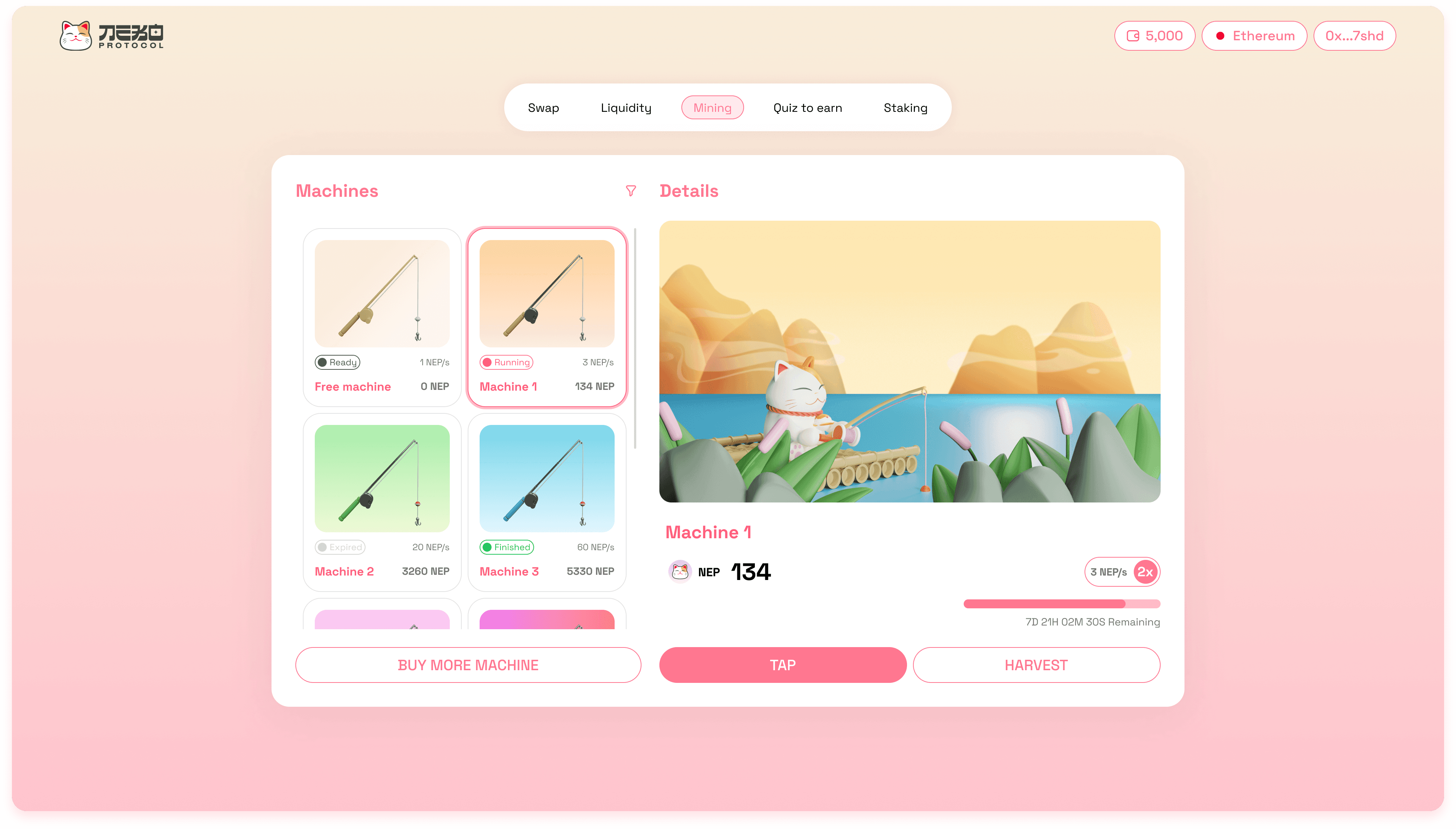
The Mining tab has two main sections: List of machines and Machine details.
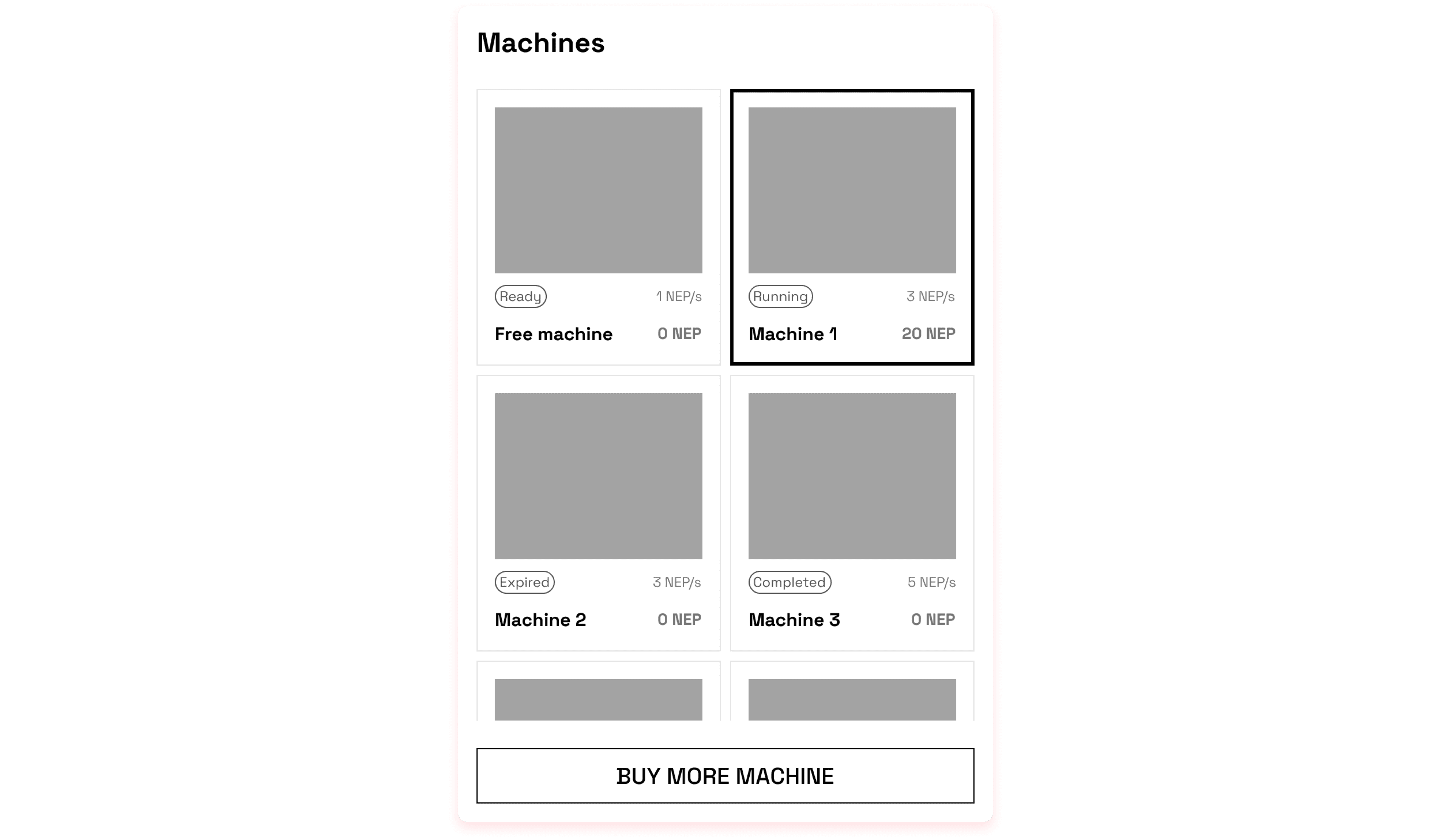
The List of machines includes all owned mining machines. Each machine card provides information about the machine name, its current state, mining speed and amount earned.
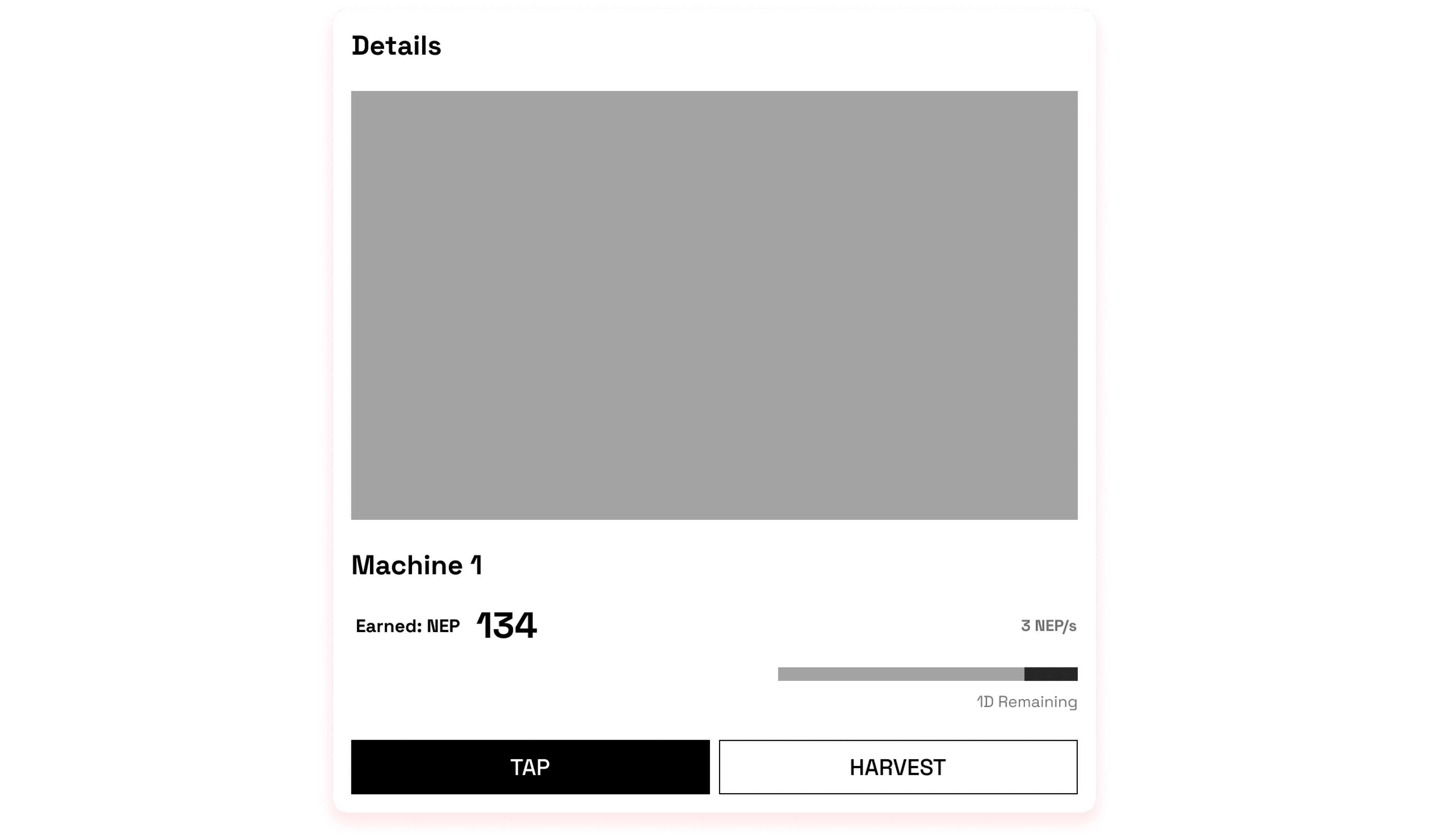
The Machine details repeats the provided information from the machine card and additionally shows the remaining running time of the machine. Furthermore, it allows miners to speed up the mining process by clicking. This provides interaction between users and the platform. Also, to fulfil users’ loss aversion, they are allowed to early harvest their earned tokens.
UI Design
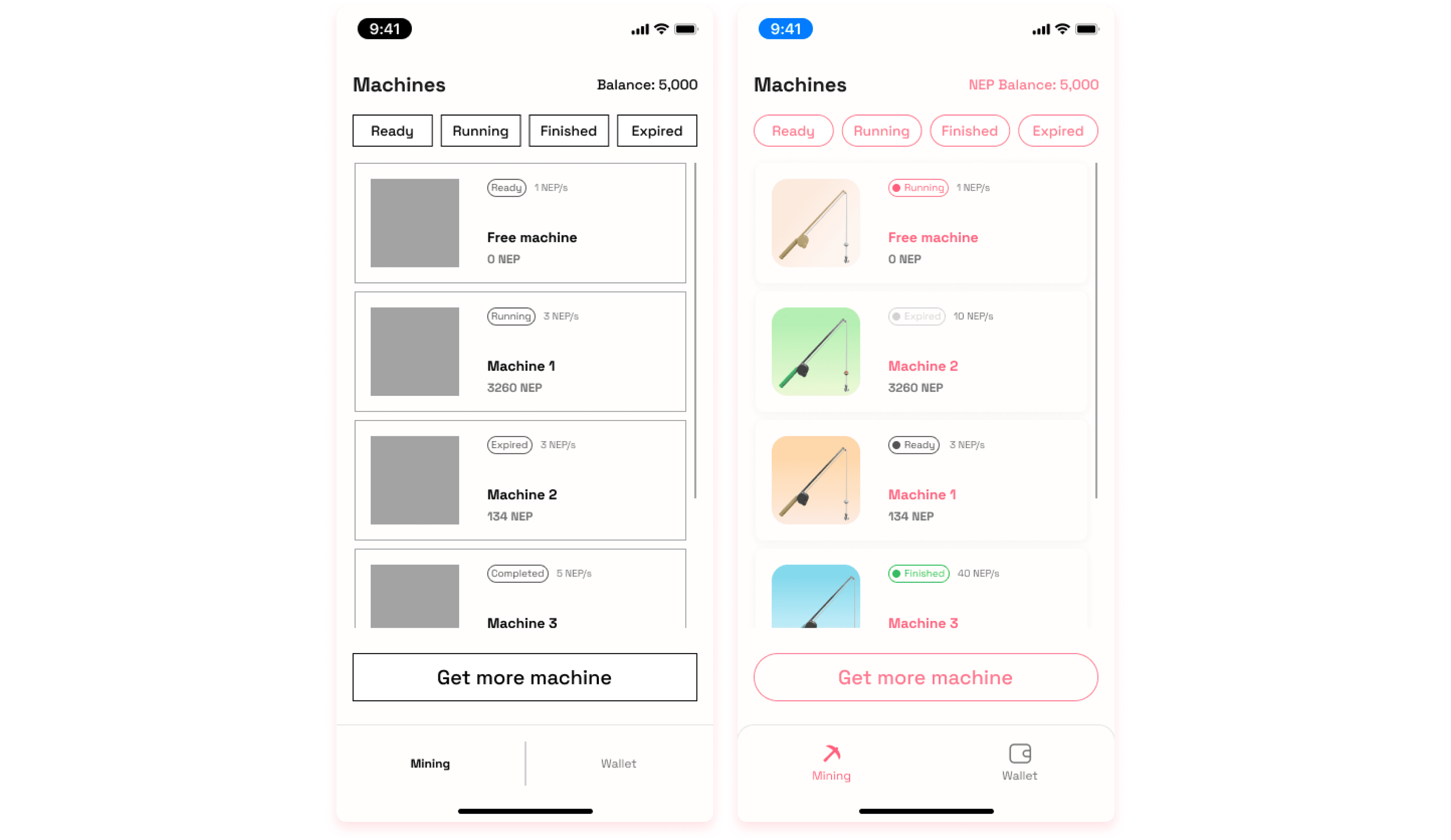
The mobile application version provides the same set of information and actions, however, due to the lack of space, the two sections are divided into 2 screens.
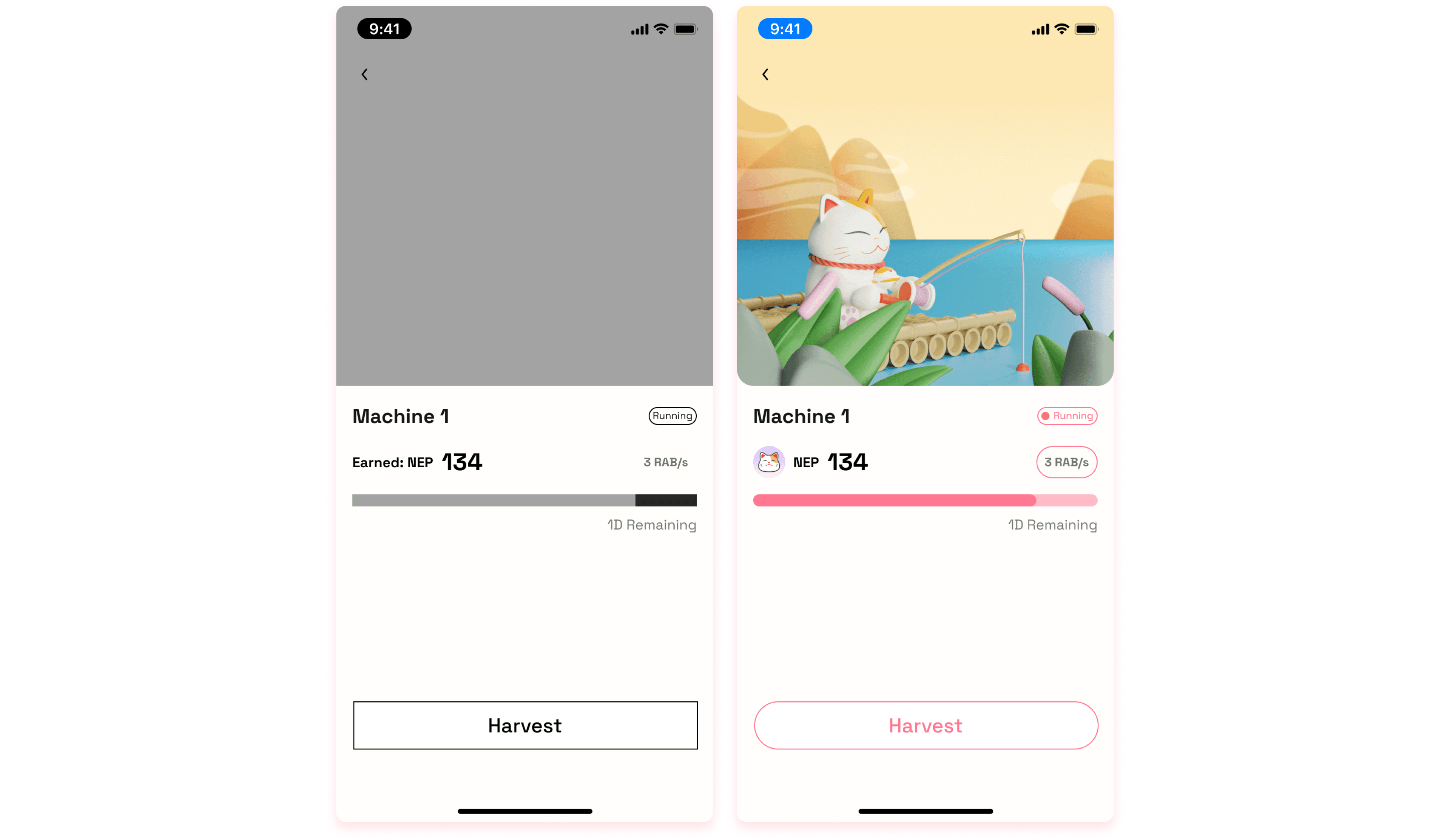
Machine details - Mobile App Version
Purchasing Mining machines
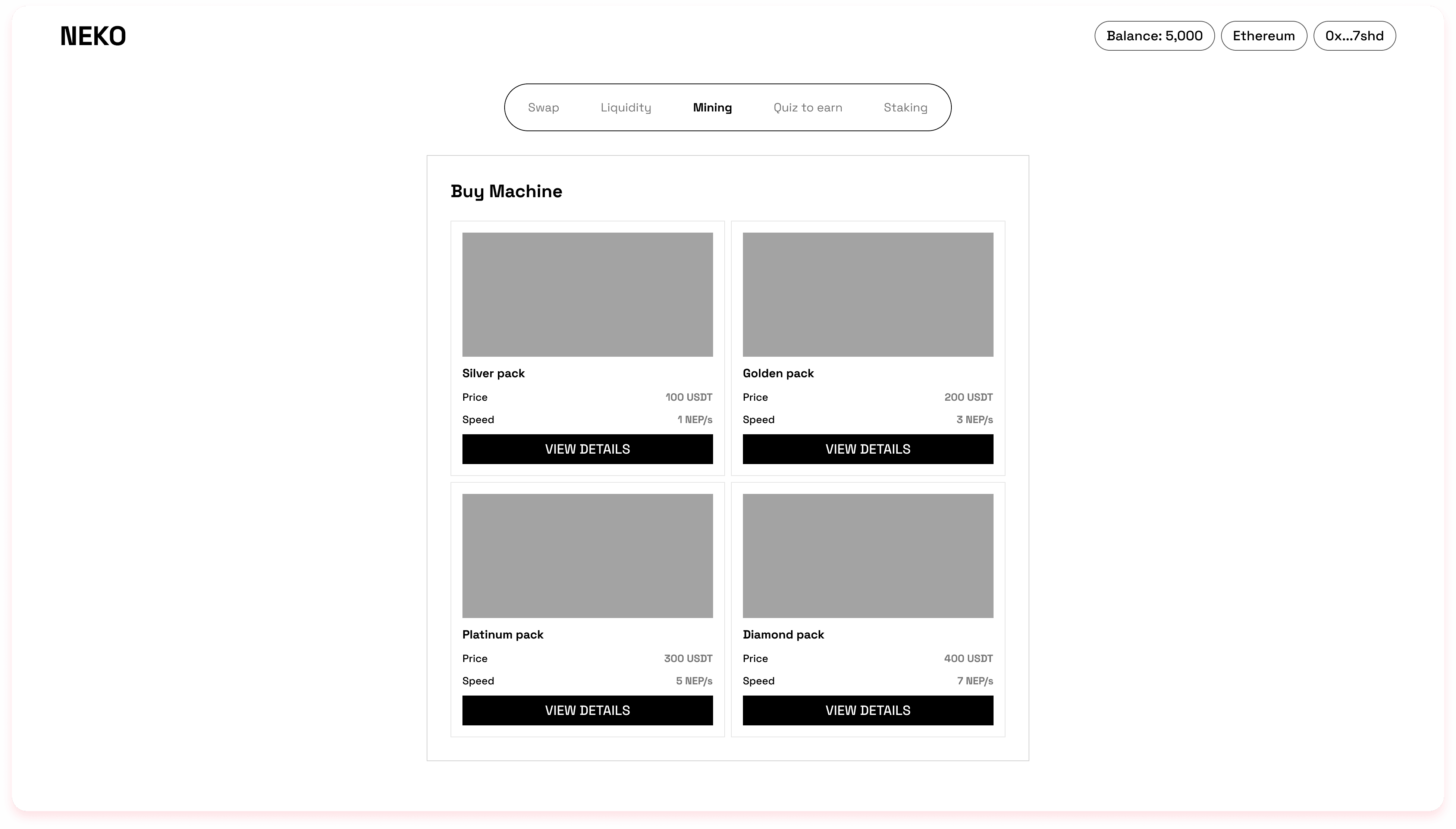
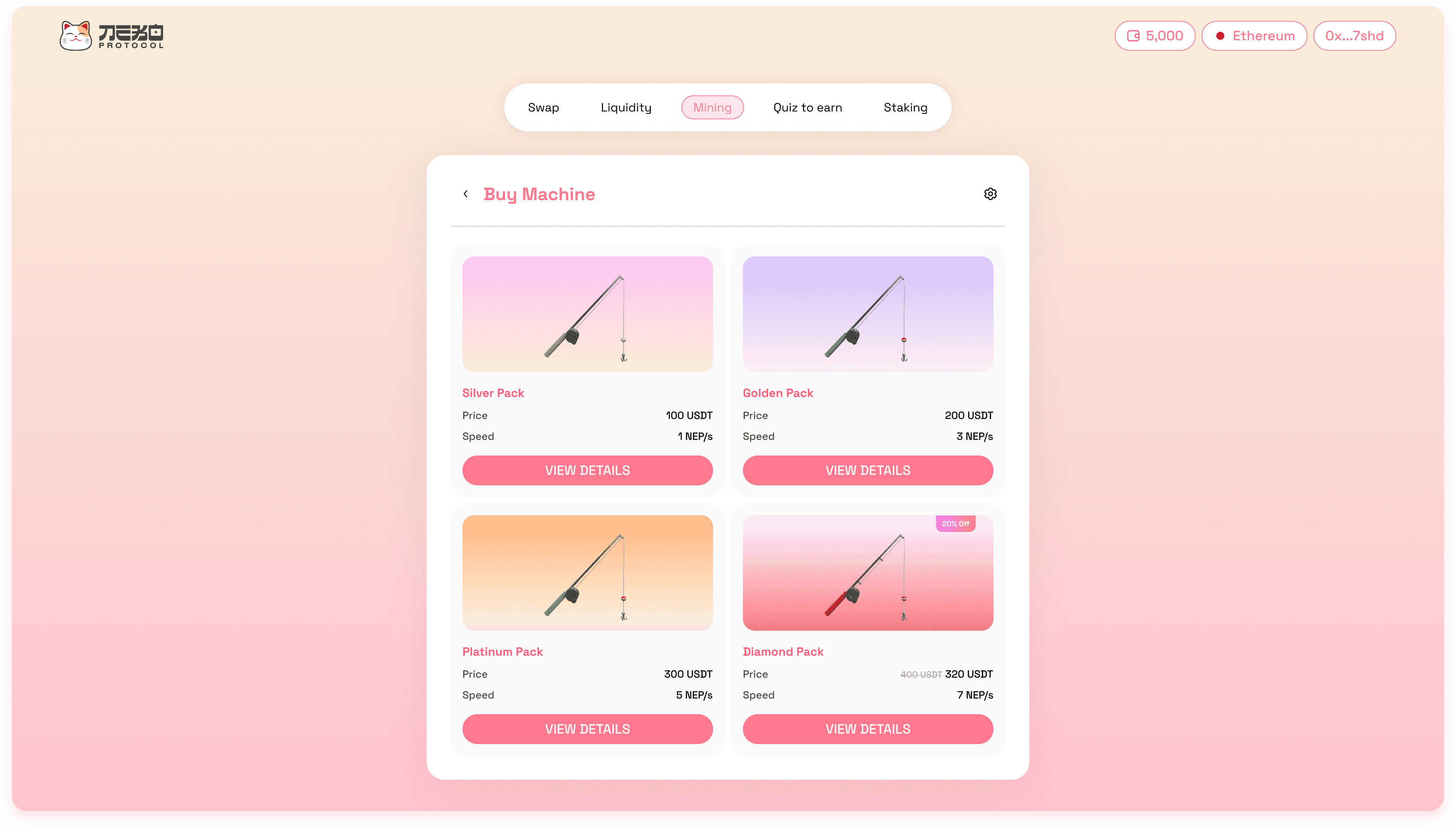
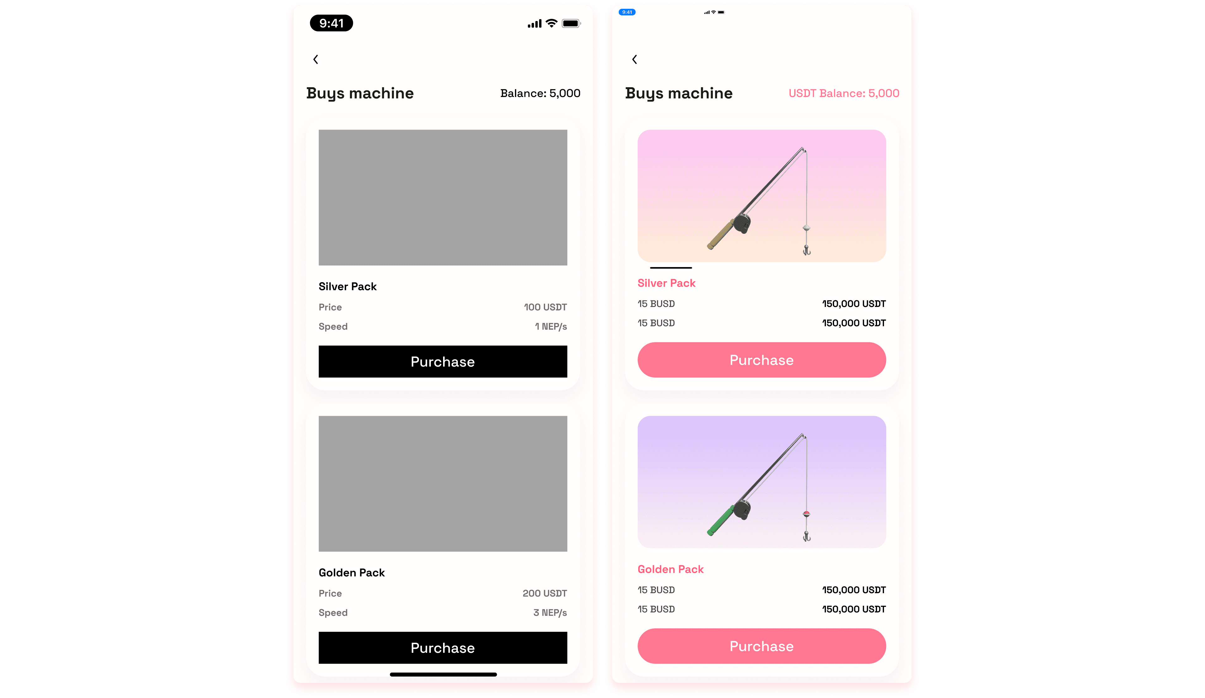
The list of available mining machines shows brief information of the machine such as price and mining speed to help users easily scan their preferences.
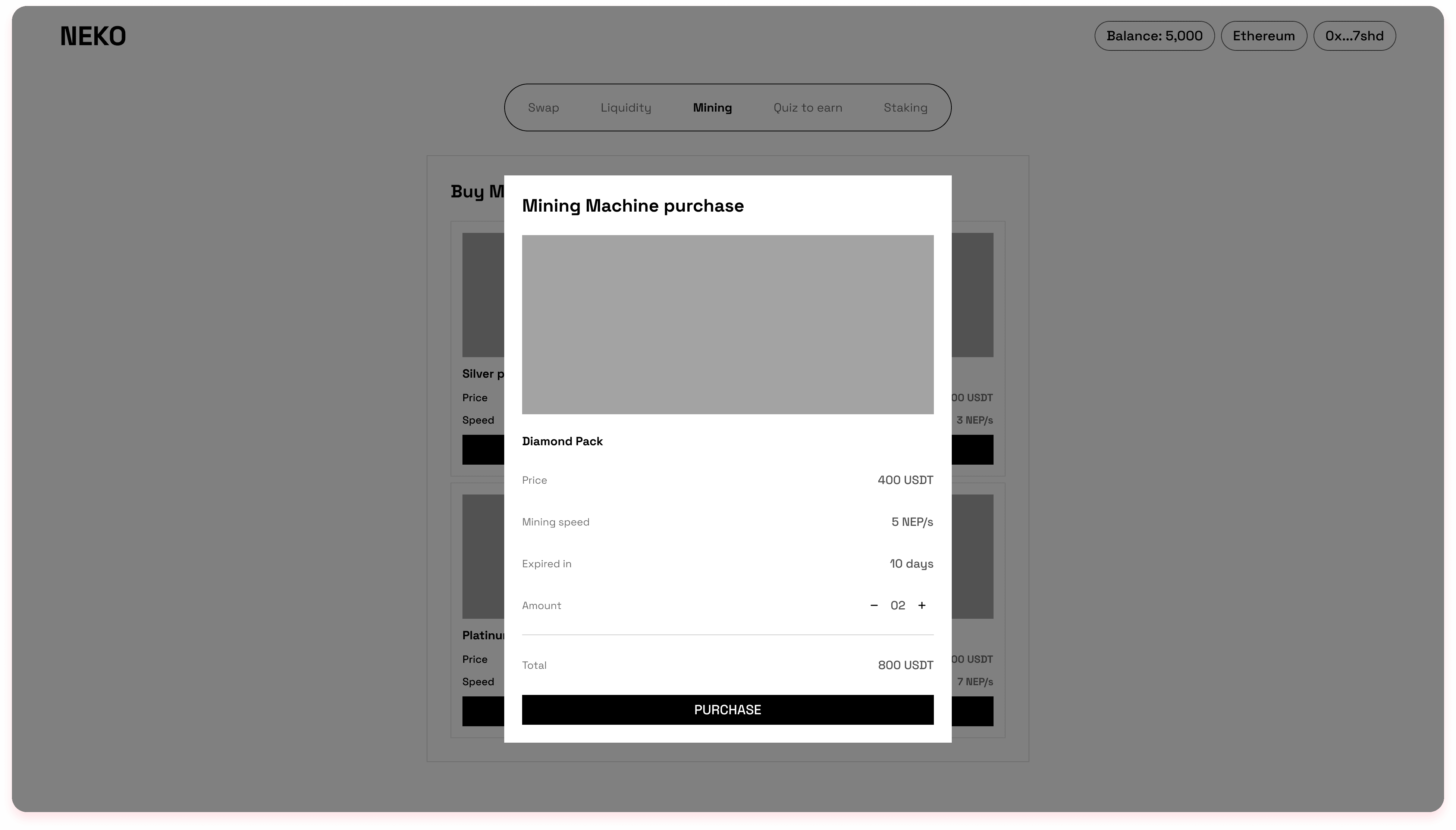
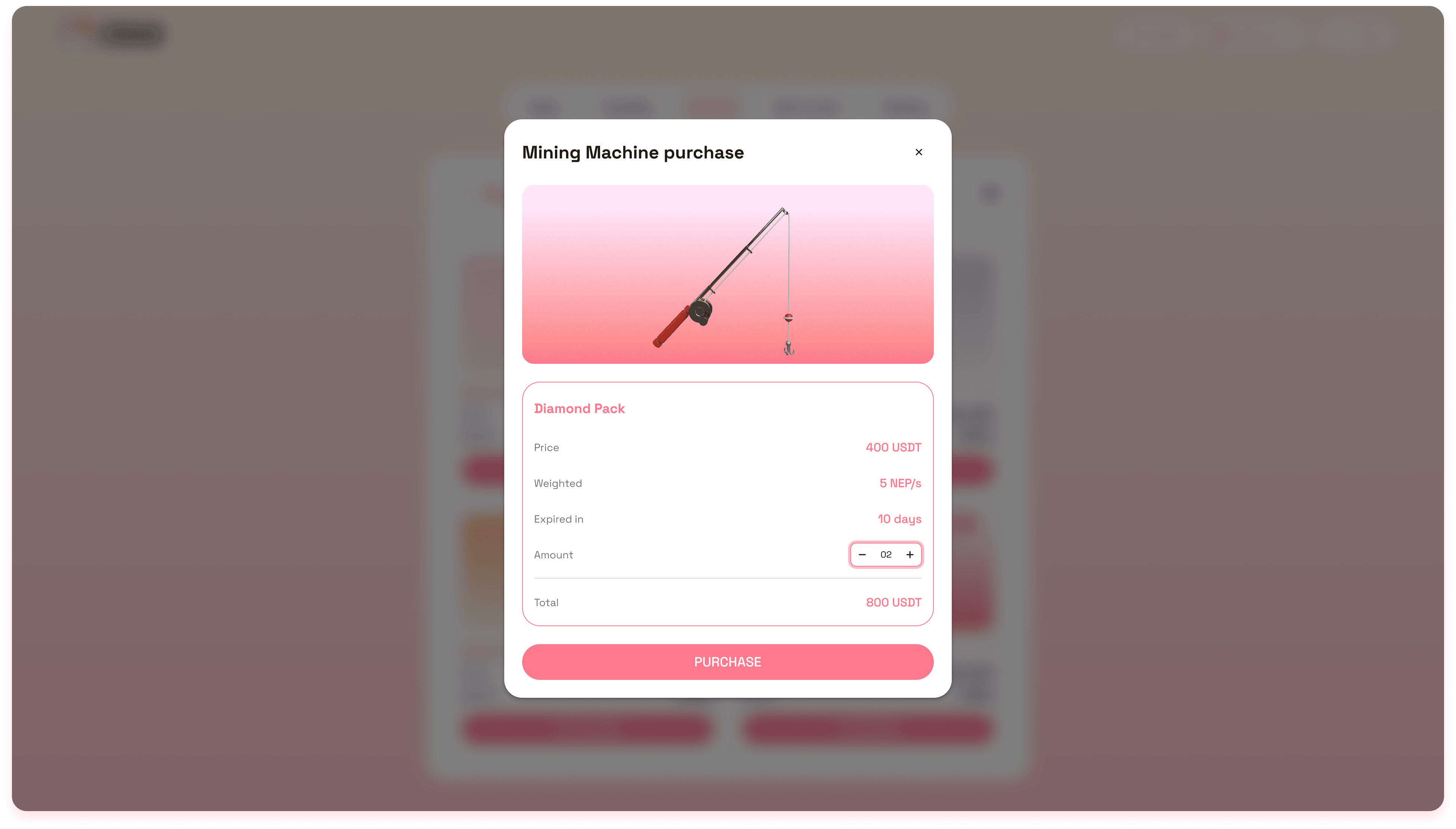
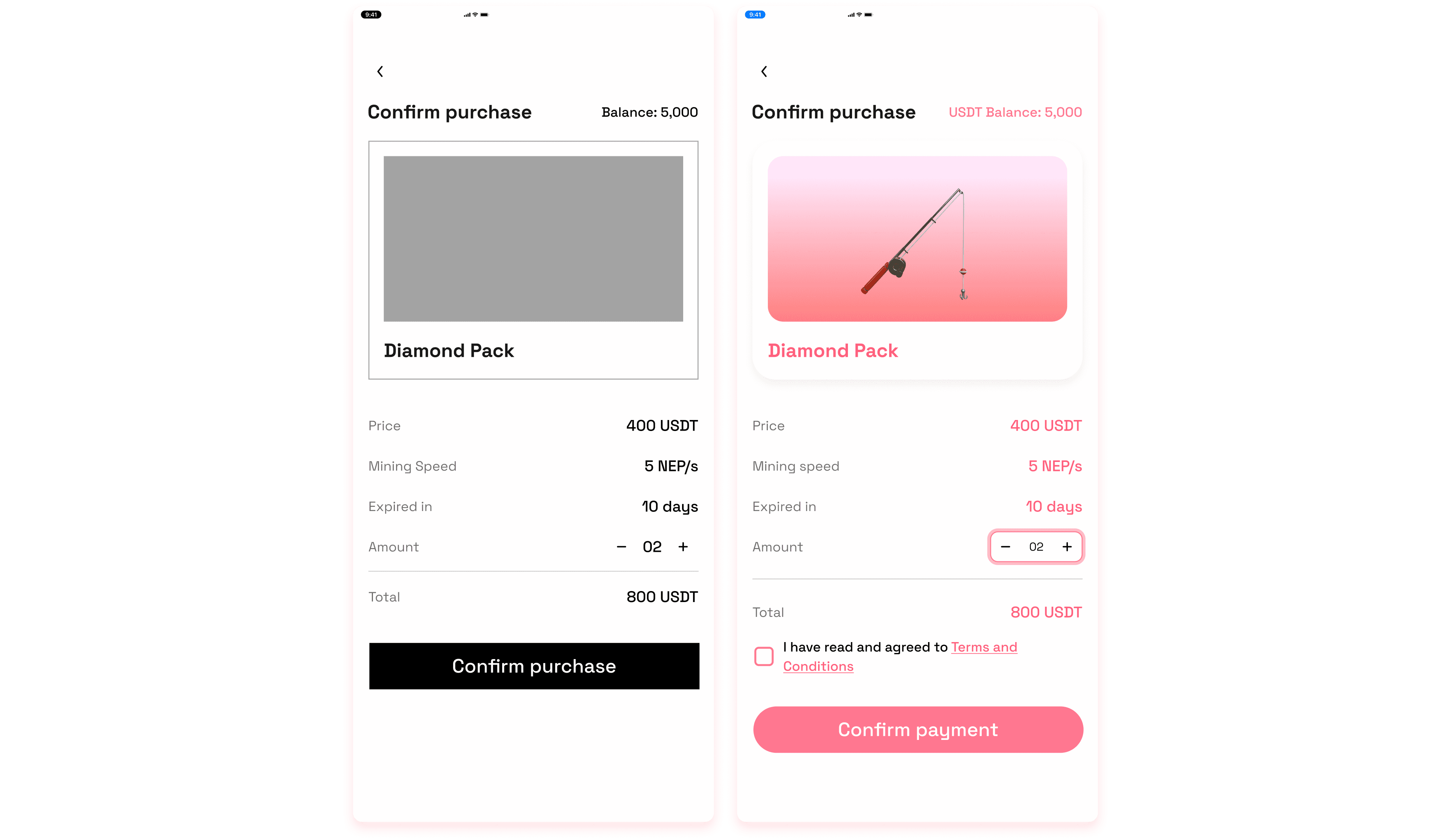
Then, users may discover more about the machine to make decision to purchase. Since the purchase confirmation will be processed within Wallet extension, a confirmation screen is not needed.
Final UI Design
List of machines - Mobile App Version
Machine details - Mobile App Version
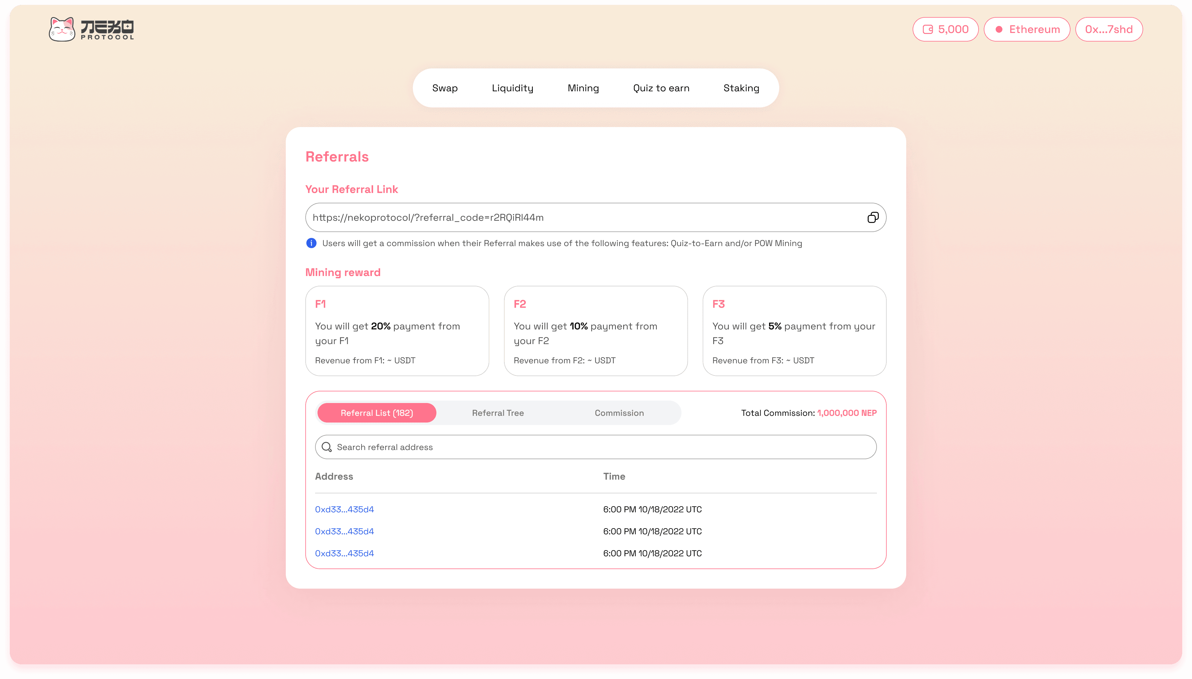
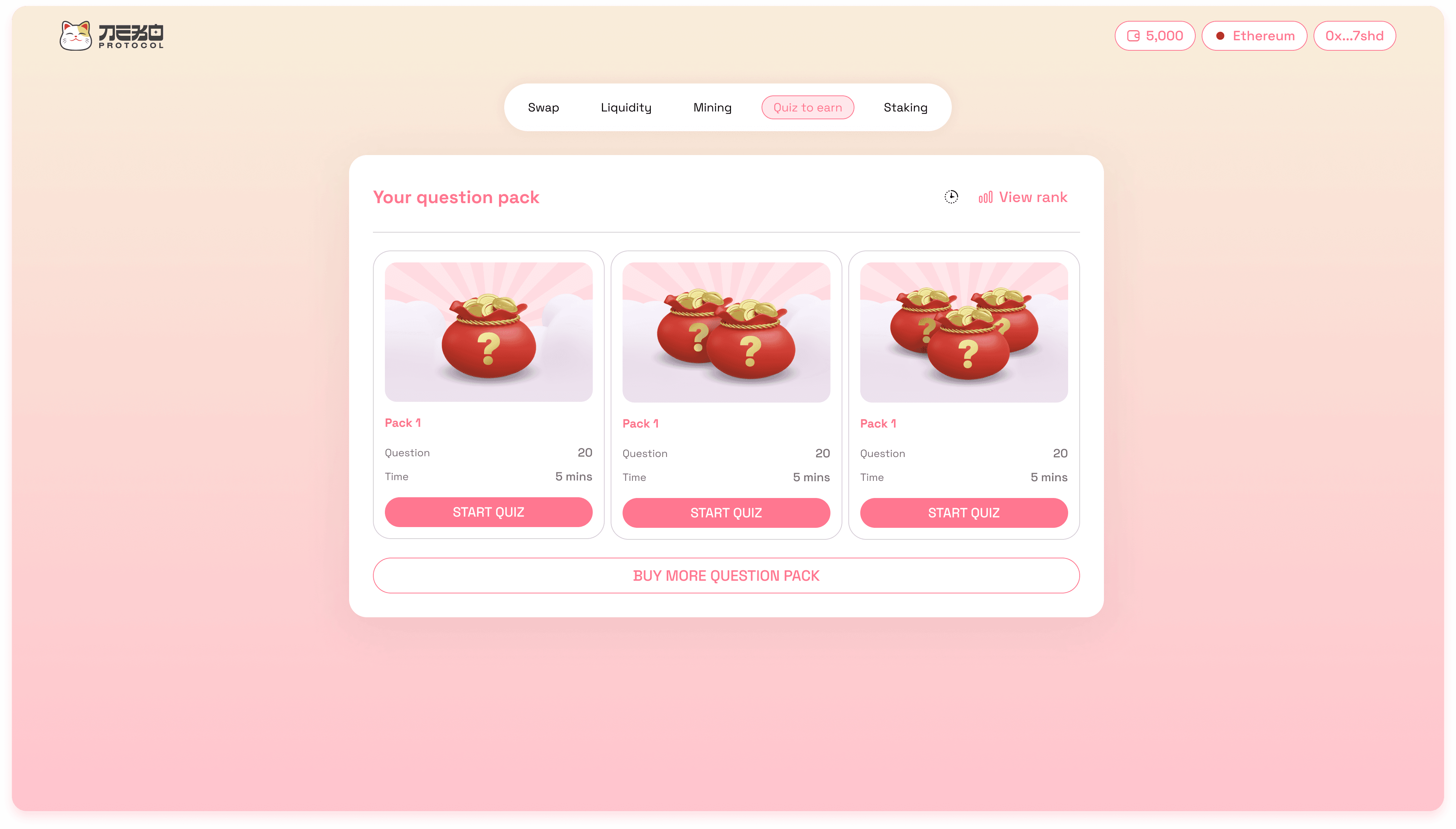
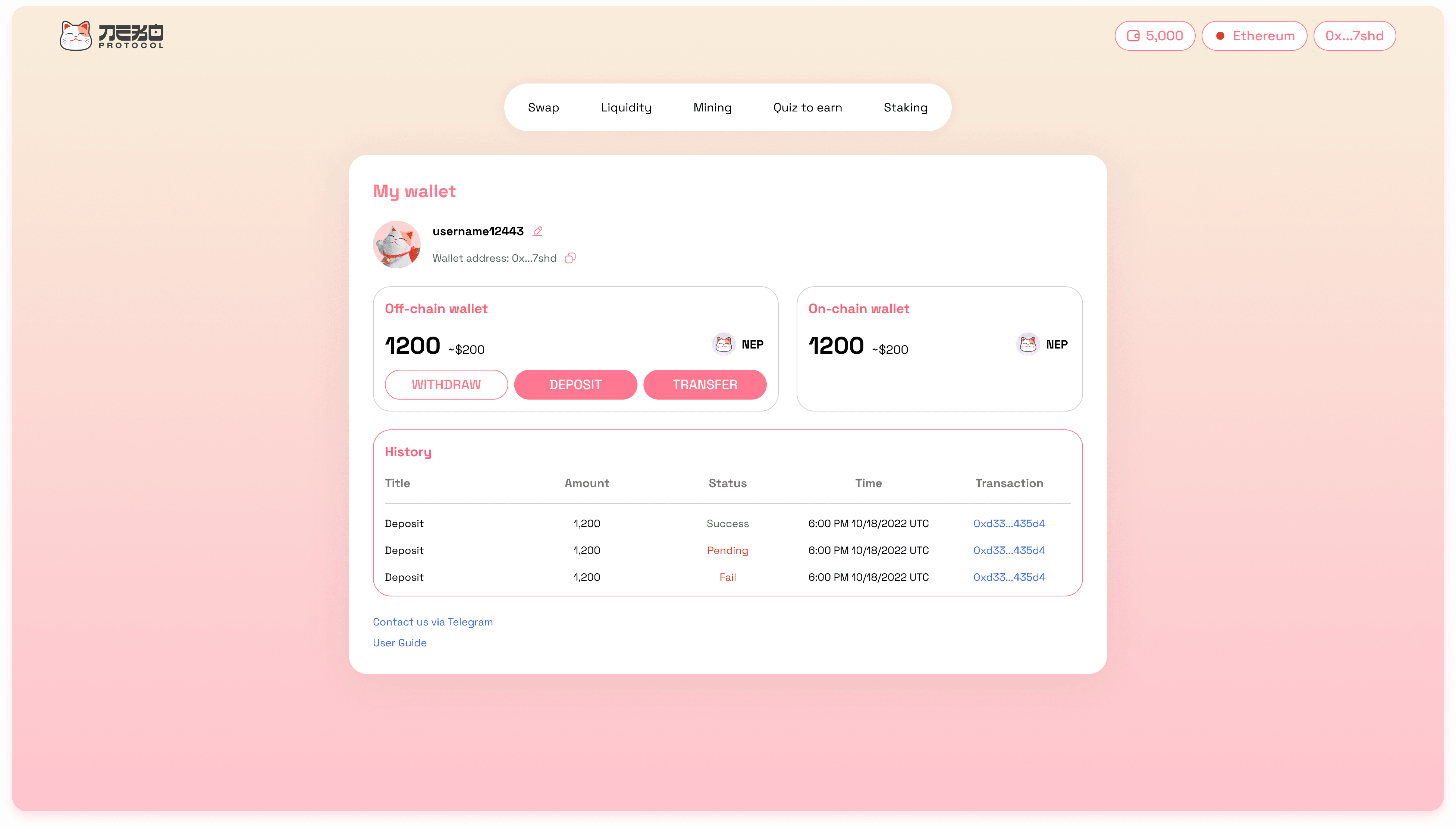
Screens showcase
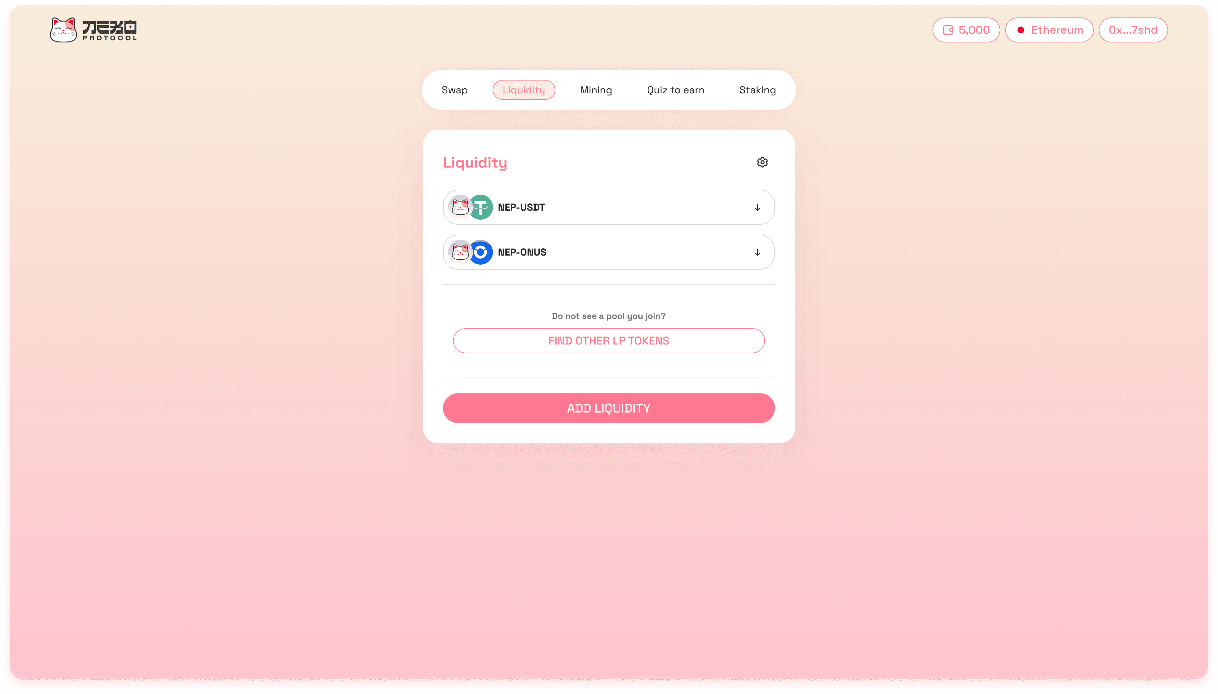
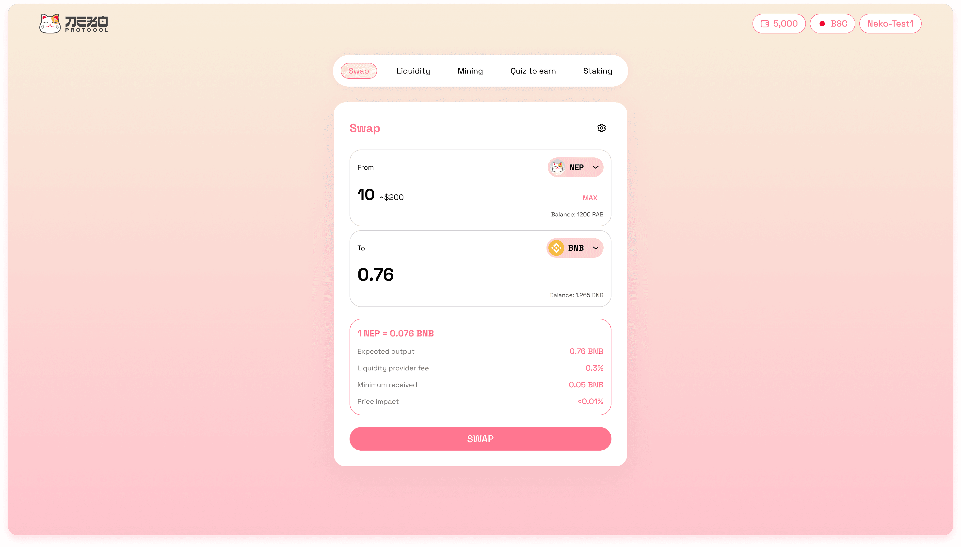
This section serves as a gallery of the project.
What I have learn from this project
Key learning #1: Be proactive in design approach I have always been complaining about having too few opportunities to practice professional UX process, however, when I was given a certain control of this project, I found out that I can always proactively apply UX approaches before then explain it to stakeholders.
Key learning #2: Empathizing with the business and technology side During the first phase of the design process, there has been conflicts between me and other stakeholders, such as what information to be displayed for build user trust, or the incentives given to users. Later, with the help of my tutor, I have learned that providing an User-centric solution is as important as optimizing technology and reaching business goals. Therefore, adjustments were made to balance and cover all goals.
Challenge(s)
✍🏻 My first time designing for POW (Proof of Work) Earning Although I have worked in FinTech in general and blockchain in particular for a while and contributed to various projects on Decentralized Exchange, this was the first time that I work on a POW Earning project. Moreover, my responsibility for this project offered me more chance for making design decisions, but also required much more research and problem solving skills.
Research
Research objective
Understand what information miners need to know when investing and managing a Cloud mining services.
Understand what motivates miners when managing the mining machines.
Key findings
Key Finding #1: Miners need to know Mining speed, duration, price of a Cloud mining machine in order to consider invest ⇒ By understanding this, I have discussed with the development team if it is possible to provide miners the required information to make their investment process more transparent and easy to understand.
Key Finding #2: While managing mining machines, miners constantly check remaining time and amount earned. ⇒ By understanding this, I have paid attention to make these information more noticeable in the design.
Key Finding #3: Users pay extra attention on securing their digital assets ⇒ By understanding this, I have considered providing users additional option to protect their money.
Design Solution
Managing the mining machines


The Mining tab has two main sections: List of machines and Machine details.

The List of machines includes all owned mining machines. Each machine card provides information about the machine name, its current state, mining speed and amount earned.

The Machine details repeats the provided information from the machine card and additionally shows the remaining running time of the machine. Furthermore, it allows miners to speed up the mining process by clicking. This provides interaction between users and the platform. Also, to fulfil users’ loss aversion, they are allowed to early harvest their earned tokens.

UI Design

The mobile application version provides the same set of information and actions, however, due to the lack of space, the two sections are divided into 2 screens.

Machine details - Mobile App Version
Purchasing Mining machines

The list of available mining machines shows brief information of the machine such as price and mining speed to help users easily scan their preferences.

Then, users may discover more about the machine to make decision to purchase. Since the purchase confirmation will be processed within Wallet extension, a confirmation screen is not needed.


Final UI Design

List of machines - Mobile App Version

Machine details - Mobile App Version
Screens showcase
This section serves as a gallery of the project.


What I have learn from this project
Key learning #1: Be proactive in design approach I have always been complaining about having too few opportunities to practice professional UX process, however, when I was given a certain control of this project, I found out that I can always proactively apply UX approaches before then explain it to stakeholders.
Key learning #2: Empathizing with the business and technology side During the first phase of the design process, there has been conflicts between me and other stakeholders, such as what information to be displayed for build user trust, or the incentives given to users. Later, with the help of my tutor, I have learned that providing an User-centric solution is as important as optimizing technology and reaching business goals. Therefore, adjustments were made to balance and cover all goals.